Converting a colour photograph to black and white is not simply desaturating the image. A masterful monochrome conversion separates tones, emphasises texture, controls contrast, and directs the viewer's eye with a precision that colour often obscures. This guide covers every major conversion method — from basic desaturation to advanced luminosity-based black-and-white workflows — and explains when and why to use each.
Why Convert to Black and White?
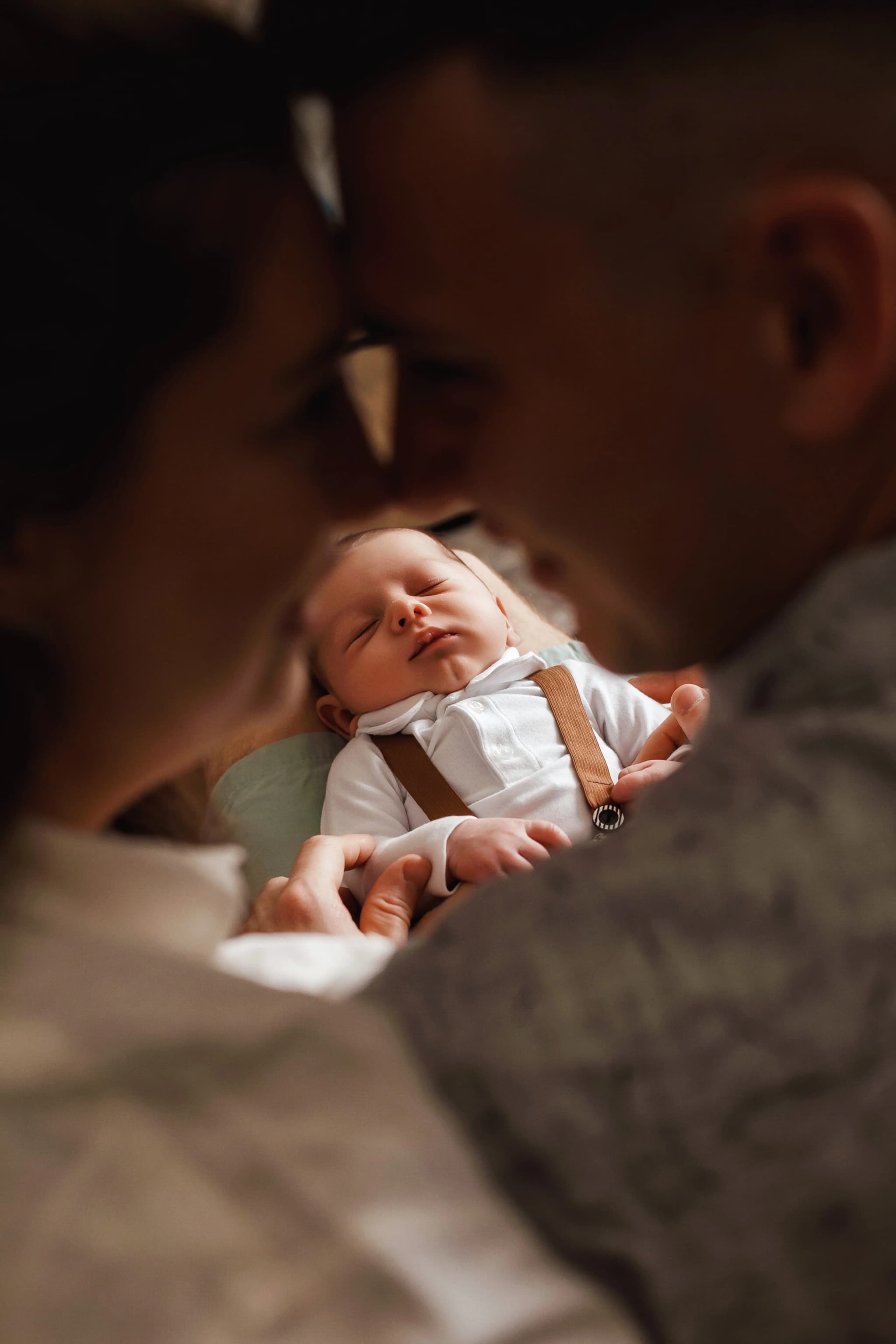
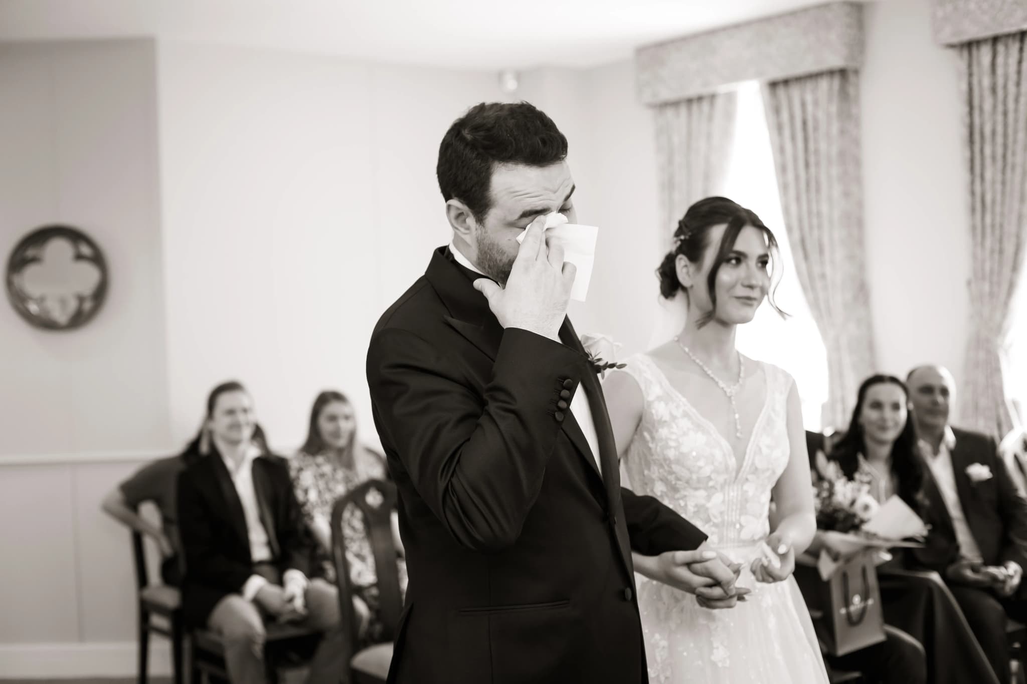
Removing colour removes distraction. The viewer sees light, shadow, form, texture, and composition in their purest state. Black-and-white photography conveys mood more directly: high contrast for drama, low contrast for softness, deep blacks for mystery, bright highlights for hope. Portraits gain intensity when skin texture and expression are isolated from skin colour. Landscapes become studies in light and form. Architecture becomes geometry.
Method 1: Desaturation (Avoid)
The simplest method — reducing saturation to zero — treats all colours equally, producing flat, muddy results. A red rose and a green leaf that are distinctly different in colour may convert to the same grey tone, leaving the image lifeless. Desaturation is almost never the best approach — it discards the tonal relationships between colours that are the key to a strong monochrome image.
Method 2: Channel Mixer
The Channel Mixer adjustment layer (Photoshop) or equivalent (Lightroom's B&W Mix panel) lets you control how much each colour channel (red, green, blue) contributes to the final grey tones. Boosting the red channel lightens skin and darkens blue skies — mimicking a red filter in traditional B&W photography. Boosting the blue channel darkens skin and lightens skies. The green channel affects foliage. This is the digital equivalent of using coloured lens filters on B&W film, and it gives you complete control over tonal separation.
Classic Filter Equivalents
- Red filter (increase red, decrease blue): Dramatic skies, bright skin, high-contrast landscapes. Classic Ansel Adams look.
- Orange filter (moderate red boost): Natural-looking portraits with smooth skin tones and slightly darkened skies.
- Yellow filter (slight red/green boost): Subtle sky darkening, gentle tonal separation. The most natural-looking conversion.
- Green filter (boost green): Lighter foliage, slightly darker skin. Useful for nature and botanical photography.
- Blue filter (boost blue): Bright skies, dark skin, moody atmospheric effect. Less common but useful for specific creative goals.
Method 3: Lightroom / Camera Raw B&W Mix
Lightroom's B&W Mix panel provides eight colour sliders (red, orange, yellow, green, aqua, blue, purple, magenta) that control how each colour in the original image maps to a grey tone. Click the "B&W" treatment mode, then adjust sliders. The targeted adjustment tool (TAT) lets you click directly on the image and drag up/down to lighten/darken that tone — the most intuitive way to work. This is the recommended method for most photographers.
Method 4: Silver Efex Pro
Silver Efex Pro (part of the Nik Collection) is a dedicated black-and-white conversion plugin with film emulation presets, control points for local adjustments, a zone system display, and advanced toning options. Many professional photographers consider it the best B&W conversion tool available. The film emulations (Tri-X, T-Max, Delta, FP4) are remarkably accurate and provide a starting point that would take significant effort to replicate manually.
Contrast and Tone Curve Control
After conversion, adjust the tone curve for the desired contrast character. An S-curve (darken shadows, lighten highlights) adds punch and drama. A flattened curve (lifted blacks, lowered whites) creates a matte, filmic look. Localised contrast (clarity/structure) enhances texture — use judiciously on portraits to avoid over-textured skin, but liberally on landscapes, architecture, and street photography.
Local Adjustments — Dodging and Burning
Dodging (lightening) and burning (darkening) are essential in black-and-white photography. In Lightroom, use the brush tool to lighten the subject's face and darken distracting background areas. In Photoshop, use a 50% grey layer set to Overlay blend mode, and paint with white (dodge) or black (burn). This is the digital equivalent of the darkroom technique Ansel Adams used on every print — selectively guiding the viewer's eye through light and shadow.
Toning
A pure black-and-white image can be toned by adding a subtle colour cast. Sepia toning (warm brown) evokes nostalgia and vintage warmth. Selenium toning (cool blue-purple) adds depth and archival character. Split toning applies different tones to shadows and highlights — warm shadows and cool highlights, for example, produce a sophisticated, dimensional look.
Which Images Convert Best?
- Images with strong tonal contrast — bright highlights and deep shadows.
- Images where colour is distracting or unimportant to the story.
- Portraits with strong directional lighting and visible texture.
- Landscapes with dramatic skies and strong compositional lines.
- Architecture and urban scenes with geometric forms and hard shadows.
- Images with strong emotion — grief, joy, solitude, intensity — where colour would dilute the mood.
A great black-and-white conversion is not a colour photograph with the colour removed — it is a new interpretation of the scene, built from light, shadow, and tonal control.
Master the tones, master the mood. Explore the portfolio.