Colour theory is the framework that explains how colours relate to each other, how they affect human emotion and perception, and how they can be used deliberately to create powerful photographic compositions. While many photographers think of composition in terms of lines, shapes, and placement, colour is equally fundamental — often more so. A photograph with a purposeful colour palette communicates mood, directs the viewer's eye, and creates visual harmony (or intentional tension) that transcends subject matter. This guide covers the colour wheel, colour relationships, warm and cool theory, colour psychology, practical application in camera and post-processing, and building a personal colour style.
The Colour Wheel
The colour wheel — developed from Isaac Newton's experiments with prisms in the 1660s — organises colours in a circle based on their light wavelength relationships. Primary colours (red, blue, yellow in traditional pigment theory; red, green, blue in light/additive theory) combine to create secondary colours (orange, green, violet in pigment; cyan, magenta, yellow in light). Tertiary colours fill the gaps between primary and secondary. The wheel is the foundation tool for understanding colour relationships. In photography, we work with light — the additive RGB model — but the compositional principles derived from the traditional wheel (complementary, analogous, triadic) apply to both systems.
Core Colour Relationships
Complementary Colours
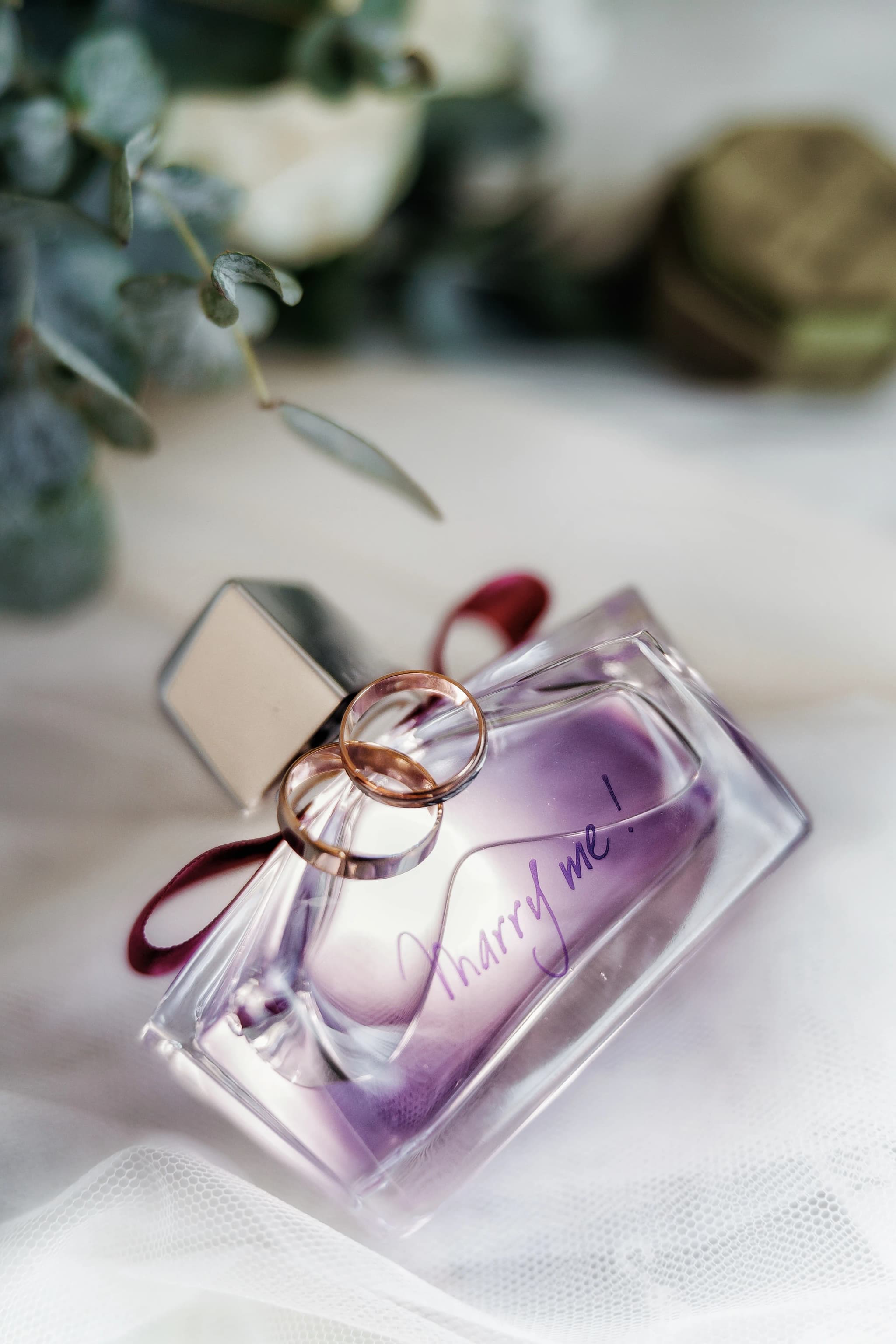
Complementary colours sit directly opposite each other on the colour wheel: red and green, blue and orange, yellow and purple. When placed side by side in a photograph, complementary pairs create maximum visual contrast and vibrancy — each colour makes the other appear more intense. The teal-and-orange colour grade dominant in cinema and editorial photography is a complementary scheme: the warm orange skin tones pop dramatically against cool teal shadows. Blue hour landscapes with warm interior lights, a yellow raincoat against a purple twilight sky, a red door on a green ivy wall — all complementary colour compositions.
Analogous Colours
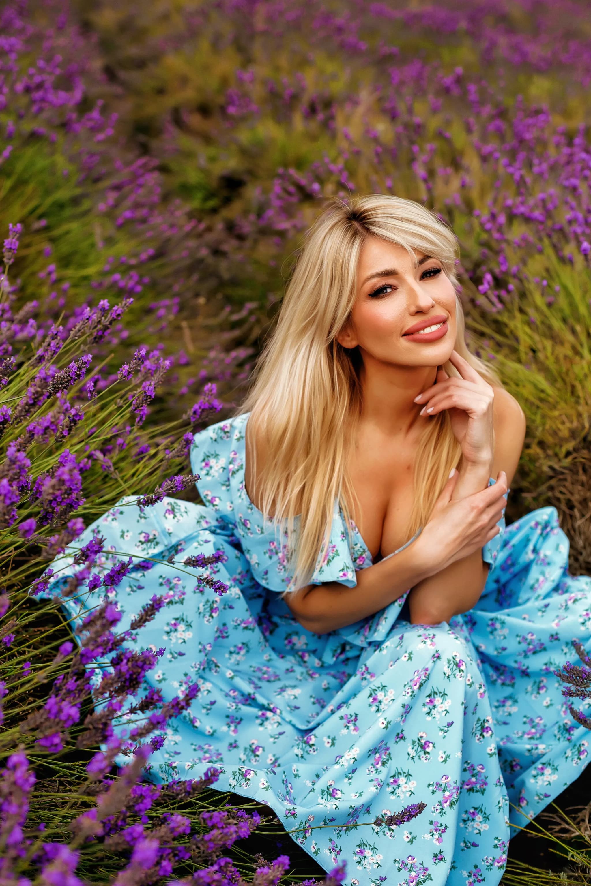
Analogous colours sit next to each other on the wheel: blue, blue-green, green; or orange, red-orange, red. Analogous palettes create harmony, unity, and a sense of natural flow. They feel calm rather than dynamic. Autumn foliage (yellow, orange, red, brown) is an analogous palette. A beach at sunset (gold, amber, peach, warm pink) is analogous. A forest canopy (yellow-green, green, teal) is analogous. Analogous schemes are found everywhere in nature, which is why they feel intuitively pleasing and require no effort to achieve if you photograph in the right light and location.
Triadic Colours
Triadic colours are evenly spaced around the wheel — the three primary colours (red, blue, yellow) form a triadic scheme. Triadic palettes are vibrant, energetic, and playful. They are hard to find in nature but common in urban environments: painted buildings, street signs, advertising, markets, carnival scenes. Using triadic colours deliberately in styled shoots or flat-lay photography creates a bold, graphic aesthetic.
Split-Complementary
A split-complementary scheme uses one base colour plus the two colours adjacent to its complement. For example, blue as the base, with yellow-orange and red-orange (the neighbours of blue's complement, orange). This provides the contrast of a complementary scheme with slightly less tension — a sophisticated, balanced palette popular in editorial and wedding photography.
Monochromatic
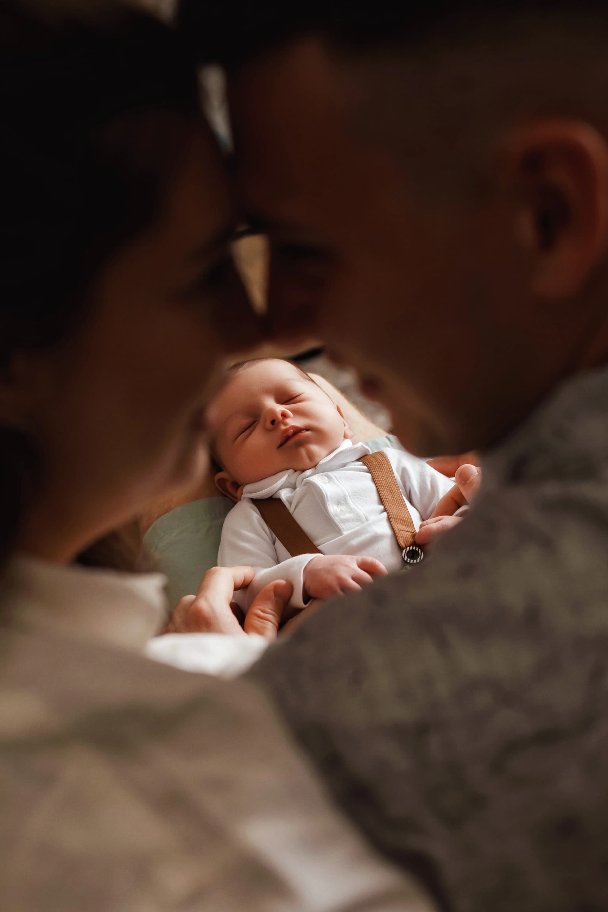
A monochromatic palette uses a single hue in various tints (lighter), tones (greyed), and shades (darker). A foggy morning landscape in shades of grey-blue; a golden hour field in variations of warm amber; a studio portrait lit entirely by a single red gel — all monochromatic. Black-and-white photography is the ultimate monochromatic scheme. Monochromatic images feel unified, moody, and focused. They draw attention to texture, form, and light rather than colour contrast.
Warm and Cool Colours
The colour wheel divides broadly into warm colours (red, orange, yellow) and cool colours (blue, green, violet). Warm colours advance — they appear to come toward the viewer, feel energetic and intimate. Cool colours recede — they appear to push back, feel calm, distant, and spacious. This principle is critical in photography: a warm subject against a cool background naturally separates and pops (portrait with warm skin against a cool blue-grey background). Landscapes with warm foreground elements and cool blue distance create a sense of depth. Understanding warm/cool dynamics helps control where the viewer's eye goes and how the image feels.
Colour Psychology in Photography
Red
Passion, urgency, power, danger, love. Red commands attention — it is the most visually dominant colour. A red element in an otherwise muted photograph draws the eye immediately. Red dresses, red doors, red lips, red flowers — all become focal points regardless of their size in the frame.
Blue
Calm, trust, sadness, distance, serenity. Blue is the most universally liked colour. Blue-toned photographs feel peaceful, melancholic, or expansive depending on context. Blue hour photography, ocean scenes, and foggy mornings leverage blue's emotional associations.
Yellow
Joy, warmth, optimism, energy. Golden hour light is yellow-to-amber, which is why golden hour photographs feel warm and happy. Yellow elements in compositions are attention-grabbing without the intensity of red.
Green
Nature, growth, freshness, tranquillity. Green is the most common colour in natural environments and typically forms the backdrop of landscape and outdoor portrait photography. It is restful and non-competitive — it supports other colours without dominating.
Orange and Amber
Warmth, comfort, autumn, nostalgia. The golden-amber palette of late afternoon light triggers associations with warmth and memory. Vintage-style edits that shift highlights toward amber tap into these associations deliberately.
Violet and Purple
Luxury, mystery, creativity, royalty. Purple appears rarely in natural lighting (twilight, certain flowers) and feels exotic when it does. Purple-toned edits (shifting shadows toward violet) create a moody, editorial, slightly unreal aesthetic.
Using Colour in Camera
Seek Colour Contrast in the Scene
Train your eye to notice colour relationships before raising the camera. Scout locations for walls, doors, foliage, sky, and clothing combinations that create complementary or harmonious palettes. A yellow bicycle against a blue wall. A red umbrella in a green park. Autumn leaves reflected in blue water. Actively seeking colour transforms the way you see the world.
Control Colour Through Wardrobe
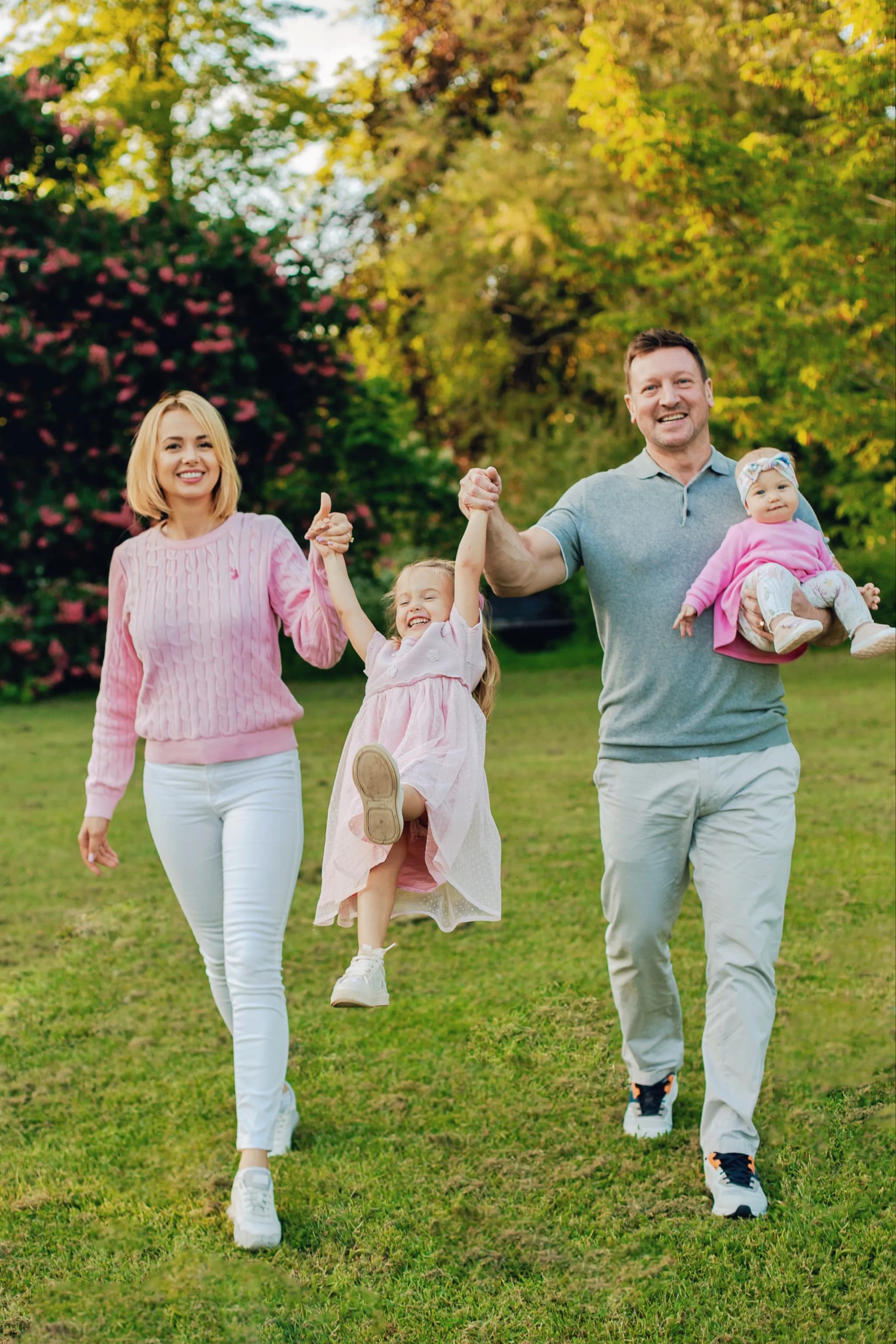
In portrait and fashion photography, wardrobe colour is a controllable variable. Advise clients to wear colours that complement the location. For an autumn woodland session, suggest warm tones (mustard, rust, burgundy) that harmonise with the foliage. For a blue-hour city shoot, suggest neutral or warm clothing that pops against the cool blue environment. Avoid clashing patterns and neon colours unless the concept demands them.
Use Time of Day for Colour Temperature
Golden hour (the hour after sunrise and before sunset) bathes everything in warm amber light — instant analogous warmth. Blue hour (20–40 minutes after sunset or before sunrise) wraps the scene in cool blue. Overcast midday light is neutral — the scene's inherent colours dominate without warm or cool bias. Choose the time of day to match the colour mood you want.
Colour in Post-Processing
White Balance as a Creative Tool
White balance is the simplest colour tool: shift it warmer for an amber/golden feel, cooler for a blue/moody feel. Tint shifts from magenta to green. In RAW processing, white balance is fully adjustable with no quality loss — experiment freely. Many signature editing styles are built primarily on a consistent white balance shift.
HSL Panel (Hue, Saturation, Luminance)
The HSL panel in Lightroom and Camera Raw gives individual control over eight colour channels. Shift the hue of oranges toward yellow for warmer skin tones. Desaturate greens slightly for a muted, film-inspired look. Darken or lighten the luminance of blues to control sky intensity. The HSL panel is where photographers build their signature colour palette — the specific way colours look in their images.
Colour Grading (Shadows, Midtones, Highlights)
Lightroom's Colour Grading panel (formerly Split Toning) lets you add a colour cast to shadows, midtones, and highlights independently. The classic teal-and-orange look: push shadows toward teal/cyan, push highlights toward orange/amber. This creates a complementary colour scheme across the tonal range — warm highlights separate from cool shadows. Subtle application (low saturation, 10–20%) creates a cohesive, cinematic mood. Heavy application (high saturation) creates a stylised editorial look.
Building Your Personal Colour Style
Consistency in colour is what makes a photographer's portfolio feel cohesive. Choose a colour direction — warm and muted, cool and contrasty, pastel and lifted, dark and rich — and apply it consistently across sessions. Create a Lightroom preset that captures your base colour treatment. Refine it over time. A recognisable colour style becomes part of your brand: clients hire you not just for your compositions but for the way colour feels in your images. Study photographers, paintings, and films whose colour palettes you admire. Analyse what they do with white balance, HSL shifts, colour grading, and saturation. Then adapt these insights into your own visual language.
Intentional colour is what separates snapshots from photographs that move people.
Colour that tells a story. Explore the portfolio.