Colour is the most powerful emotional tool in photography. Before the viewer reads the subject, the composition, or the story, they feel the colour — warmth, coolness, energy, calm, tension, harmony. Understanding colour theory transforms a photographer from someone who captures what's in front of them into someone who deliberately controls how an image feels. This guide covers the colour wheel, colour relationships, colour psychology, and practical applications for wedding, portrait, and fine-art photography.
The Colour Wheel — Foundation of Everything
The colour wheel arranges hues in a circle based on their relationships. It starts with three primary colours — red, yellow, blue. Between them sit secondary colours (orange, green, violet), formed by mixing adjacent primaries. Between those sit tertiary colours (red-orange, yellow-green, blue-violet, etc.). Every colour relationship used in photography, painting, fashion, and design derives from positions on this wheel.
Colour Relationships That Work
Complementary Colours
Colours directly opposite each other on the wheel: red and green, blue and orange, yellow and violet. Complementary pairs create maximum contrast and visual energy — they vibrate against each other, each making the other appear more intense.
- Orange and teal: the most dominant colour scheme in contemporary cinema and photography. Warm skin tones (orange) against cool shadows and backgrounds (teal) creates a universally appealing contrast. This is why so many film colour grades push toward orange-and-teal.
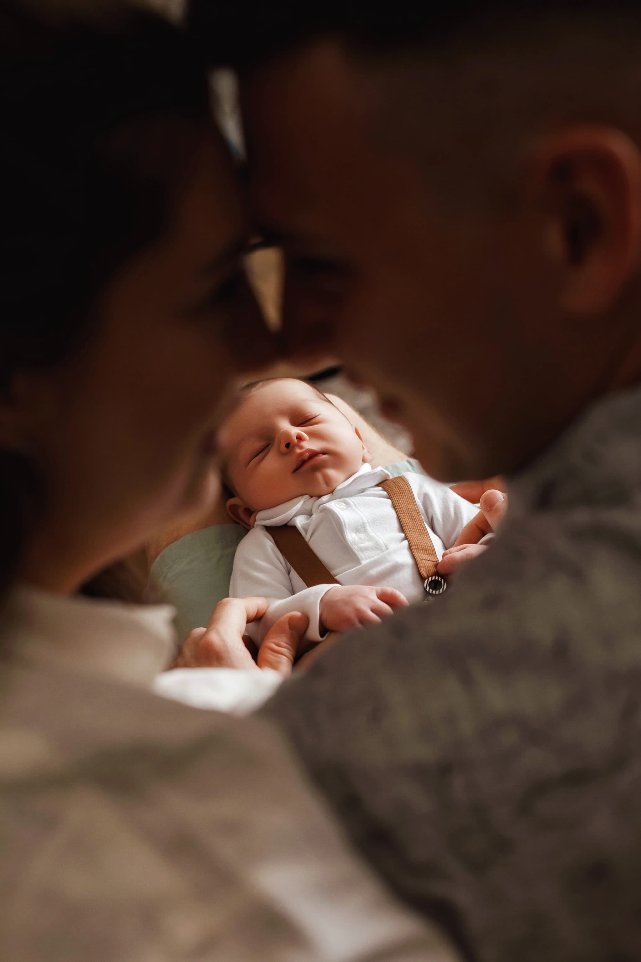
- Red and green: a bride in a red dress against green garden foliage. The colours amplify each other — the red pops, the green appears more lush.
- Yellow and violet: warm golden-hour light against twilight purple sky. The transition from warm to cool during blue hour embodies this relationship.
Analogous Colours
Colours adjacent to each other on the wheel: yellow, yellow-orange, orange. Analogous schemes are harmonious and soothing — the colours flow naturally into each other without contrast or tension. They feel unified, cohesive, calm.
- Warm analogous (red, orange, yellow): golden-hour portraits where skin, sky, and foliage all share warm tones. The image feels like a single glowing moment.
- Cool analogous (blue, blue-violet, violet): twilight portraits, overcast seaside images, winter scenes. Everything shares a cool, quiet tone.
- Green analogous (yellow-green, green, blue-green): forest and garden photography. All the greens harmonise — fern, moss, leaf, grass — varying in shade but unified in hue.
Triadic Colours
Three colours equally spaced on the wheel: red, yellow, blue or orange, green, violet. Triadic schemes are vibrant and balanced — each colour has equal visual weight. They're energetic without being chaotic.
- In practice: a bride in a blue-trimmed dress against an autumnal orange tree and green lawn — three colours in natural harmony.
- Styled shoots: triadic colour palettes are popular in editorial and styled wedding shoots because they produce visually striking, balanced compositions.
Split-Complementary
Instead of the direct complement, use the two colours on either side of it. For example, instead of blue and orange, use blue with red-orange and yellow-orange. This maintains complementary contrast but is less intense and more nuanced.
Monochromatic
A single hue in varying shades, tints, and saturations. A monochromatic image in blue — navy shadows, sky-blue midtones, powder-blue highlights — is cohesive, elegant, and focused. Monochromatic colour schemes are inherently sophisticated and are the foundation of many fine-art photography styles.
Colour Psychology in Photography
Colours carry emotional associations that influence how viewers feel about an image:
- Red: passion, energy, urgency, love, danger. A red dress commands attention. Red details (lips, flowers, shoes) create focal points.
- Orange: warmth, joy, creativity, enthusiasm. Sunset tones feel optimistic and inviting. Orange in décor and florals adds energy without aggression.
- Yellow: happiness, sunshine, optimism, caution. Yellow flowers, golden light, and mustard tones feel cheerful and warm.
- Green: nature, growth, freshness, calm, renewal. Garden settings, foliage backgrounds, and green bridesmaid dresses feel organic and serene.
- Blue: trust, calm, depth, sadness, professionalism. Blue sky, ocean, twilight — cool, contemplative, spacious.
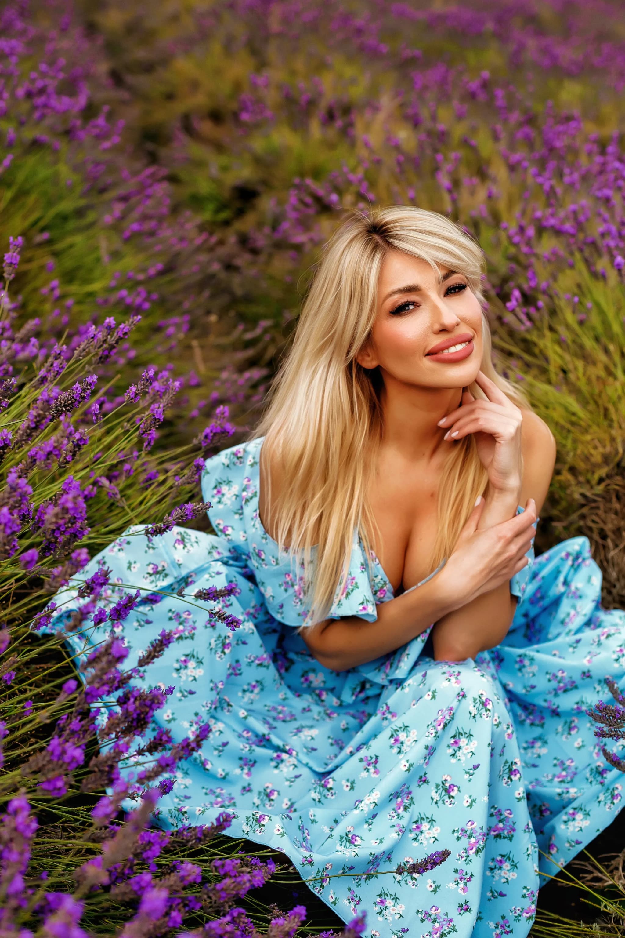
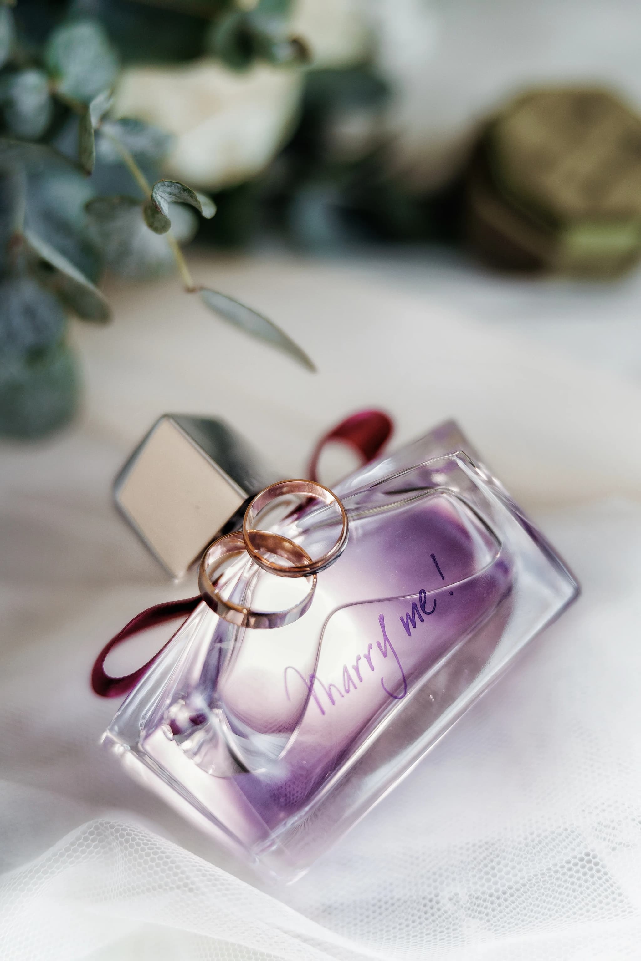
- Violet/Purple: luxury, mystery, spirituality, royalty. Purple florals, twilight skies, and lavender fields feel rich and elevated.
- White: purity, simplicity, cleanliness, space. The bridal gown, white venues, minimal backgrounds — openness and clarity.
- Black: elegance, power, mystery, formality. Black tie, dark venues, silhouettes — sophisticated and dramatic.
- Gold: luxury, wealth, warmth, celebration. Gold décor, warm light, champagne tones — festive and opulent.
Applying Colour Theory to Wedding Photography
Working with the Wedding Colour Palette
Most weddings have a deliberate colour palette — bridesmaid dresses, florals, table décor, stationery, and venue styling all coordinated. Understanding colour relationships helps you:
- Position subjects against backgrounds that complement their outfit colours.
- Compose shots that emphasise the colour harmony the couple planned.
- Recognise when clashing colours in the background will undermine the composition — and reposition to avoid them.
- Use the venue's natural colours (stone, wood, garden foliage) to create colour stories that complement the wedding palette.
Colour in Post-Processing
Colour theory informs every editing decision:
- White balance: warming shifts the image toward orange, creating intimacy and nostalgia. Cooling shifts toward blue, creating distance and moodiness.
- Colour grading / split toning: adding warm tones to highlights and cool tones to shadows (or vice versa) creates a complementary colour relationship within a single image.
- Selective saturation: desaturating distracting background colours while keeping the subject's colours vibrant focuses attention and simplifies the colour palette.
- HSL adjustments: shifting specific hue ranges (making oranges more red, or greens more teal) can align the entire image with a deliberate colour scheme.
Guiding Clients on Colour Choices
Photographers with colour theory knowledge can advise clients:
- Dusty pink bridesmaid dresses photograph beautifully against green garden backgrounds — a natural complementary pairing.
- Navy blue suits complement warm skin tones — an orange-blue complementary relationship.
- Gold décor elements match golden-hour outdoor timing — analogous warm harmony.
- Avoid neon or highly saturated colours that overpower skin tones and can't be toned down in editing.
Colour Temperature and Mood
Colour temperature — measured in Kelvin — shifts the overall colour of the image:
- Warm (3000-4500K): candle light, golden hour. Produces amber, orange, and golden tones. Associated with romance, intimacy, nostalgia.
- Neutral (5000-5500K): midday daylight. True colours, balanced rendering.
- Cool (6500-10000K): overcast sky, shade, twilight. Produces blue and blue-grey tones. Associated with calm, distance, melancholy.
Creating Colour Stories in Albums
A thoughtfully sequenced wedding album uses colour to create emotional rhythm:
- Morning preparation: soft, neutral tones — white, cream, pale pink.
- Ceremony: the venue's architecture and florals dominate — stone, wood, greenery.
- Outdoor portraits: golden-hour warmth — amber, gold, soft green.
- Reception: rich, saturated tones — candlelight gold, deep floral colours, evening blue.
- Dance floor: vibrant, mixed colours — DJ lights, colour gels, energy.
Deliberate colour — in shooting, in editing, in every image delivered.
Every photograph colour-graded with intention, every album a cohesive colour story from morning to midnight. View the colour-rich portfolio.