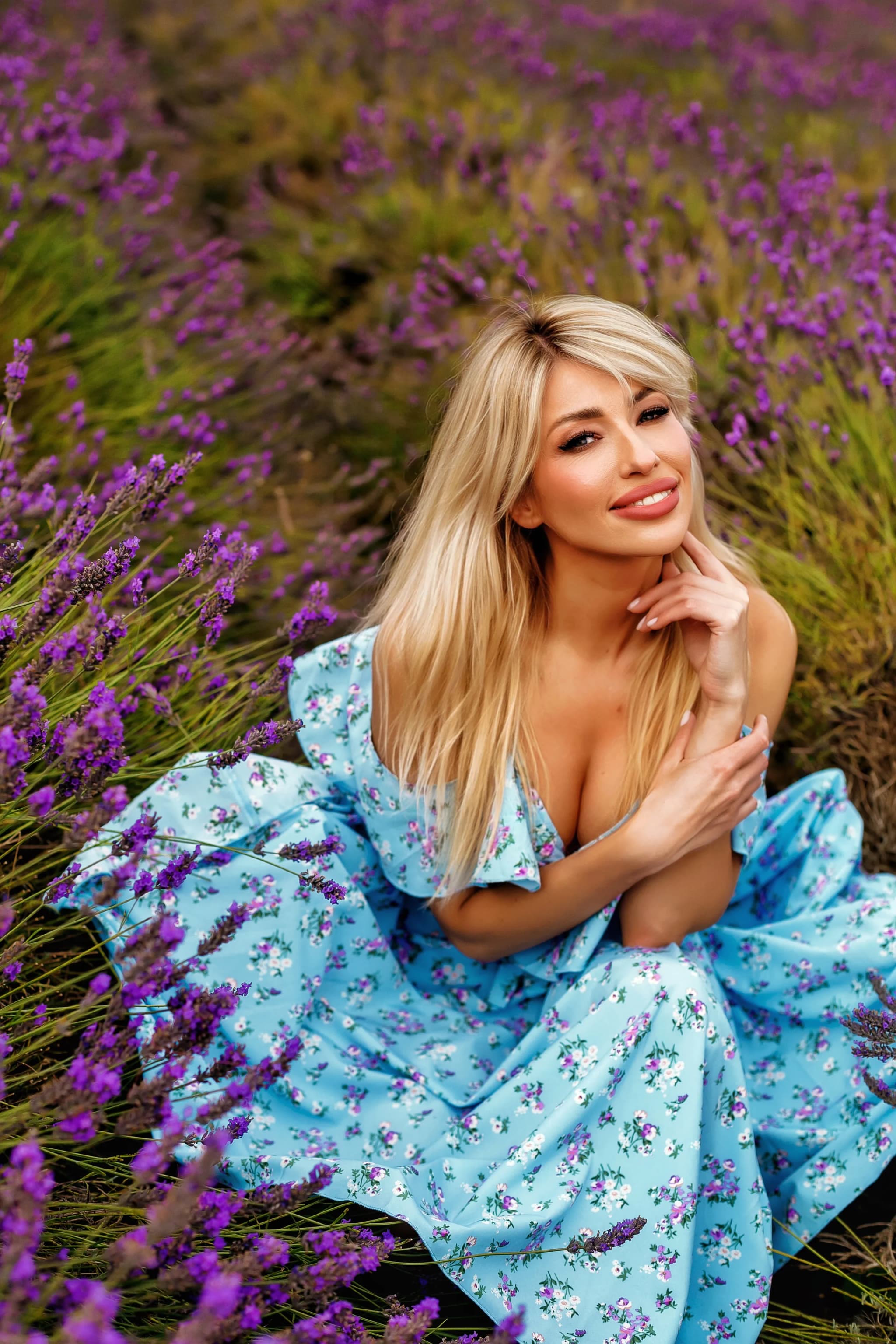
Skin Tone Editing in Photography: The Complete Guide to Natural Skin Colour, HSL Adjustments, Colour Correction, Diverse Skin Tones, and Achieving Flattering, Accurate Skin in Every Portrait
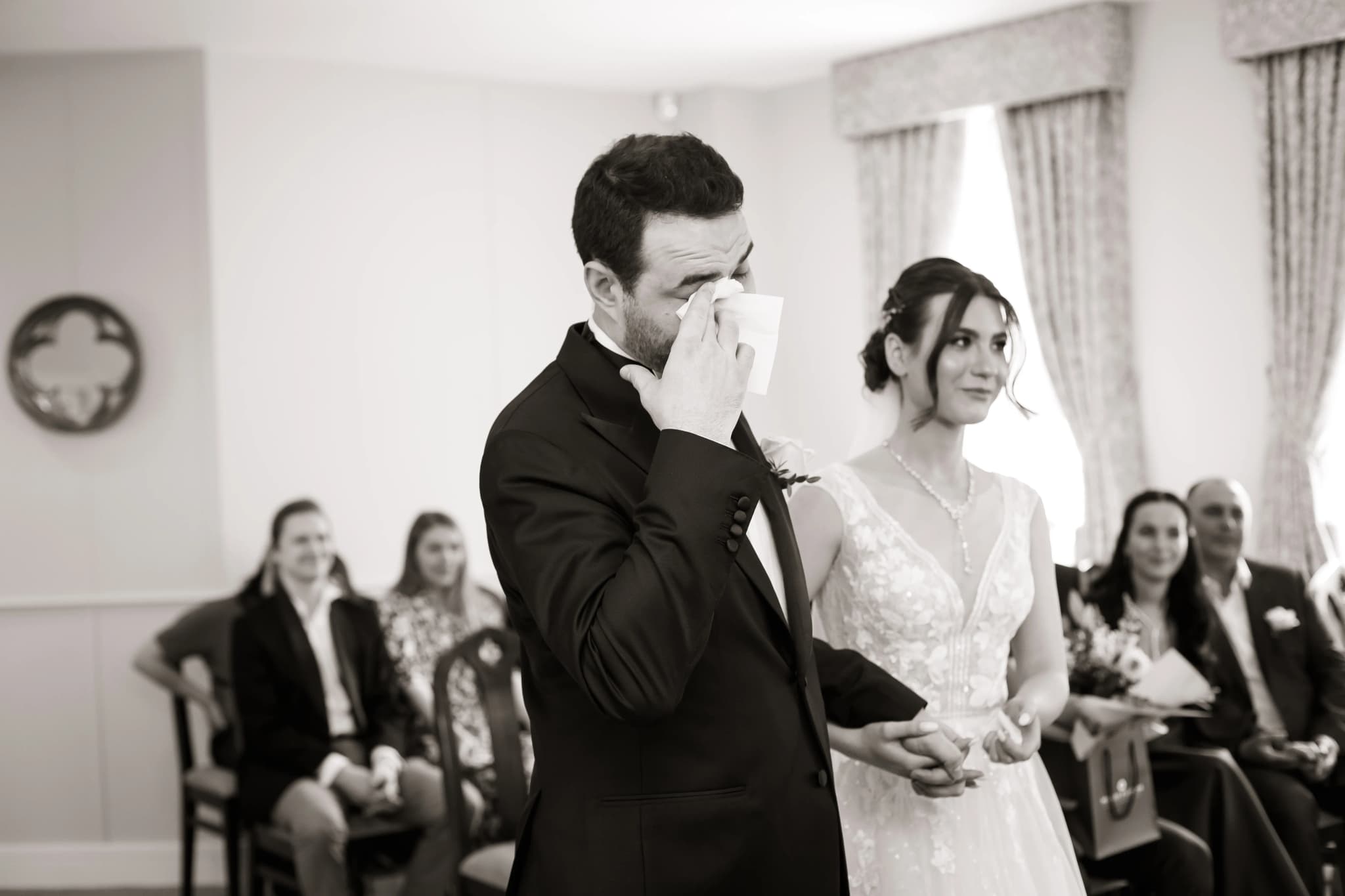
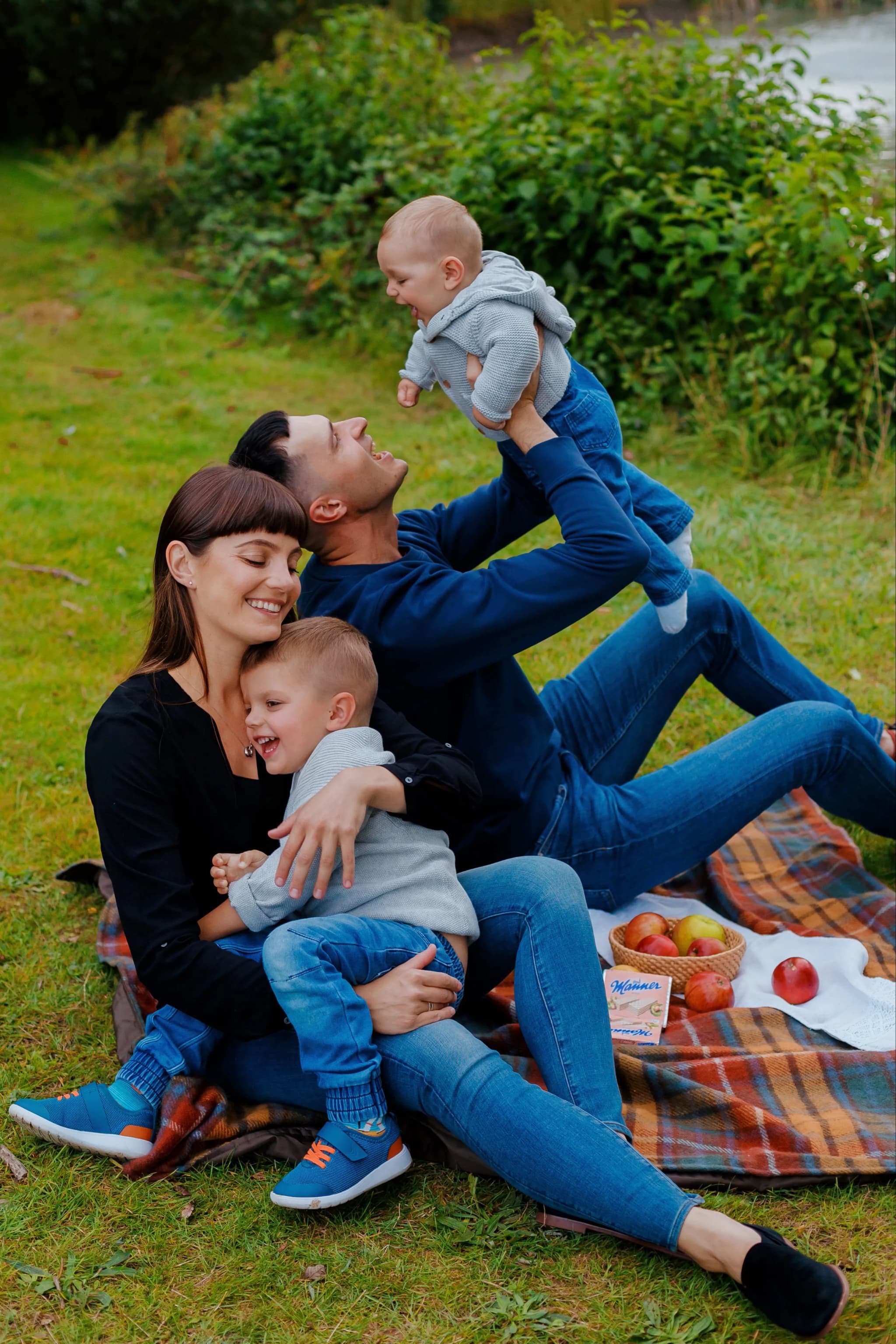
Skin tone is the most scrutinised element in portrait photography — viewers instinctively recognise when skin colour looks wrong, even if they cannot articulate what is off. Skin that is too orange, too yellow, too pink, too grey, or too green immediately triggers a negative response, while skin that is warm, vibrant, and naturally coloured reads as healthy, beautiful, and professionally photographed. Mastering skin tone editing — the ability to achieve flattering, accurate, natural skin colour across every skin tone, lighting condition, and camera/lens combination — is one of the most valuable skills a portrait photographer can develop.
The challenge of skin tone editing is its subtlety and the narrow range of acceptable colour. A shift of just 3–5 degrees of hue in the orange channel can take skin from flattering to sickly. The difference between warm and too warm, between golden and orange, between porcelain and washed-out, is measured in tiny adjustments. This guide covers the technical foundations of achieving beautiful skin colour — from white balance and HSL adjustments to colour calibration and managing diverse skin tones — with specific, practical values that produce professional results consistently.
The Colour of Skin: Understanding Hue, Saturation, and Luminance
In any colour system, skin colour falls within a remarkably narrow hue range — approximately 15–35 degrees on the HSL colour wheel (the orange-yellow region), regardless of ethnicity. What varies between skin tones is primarily luminance (brightness — from deep ebony to pale porcelain) and saturation (colour intensity — from richly pigmented to lightly tinted), not hue. A common misconception is that dark skin and light skin have fundamentally different hues; in reality, the underlying orange base is consistent, with variations in luminance, saturation, and the relative warmth or coolness of the secondary tones creating the visual diversity we perceive.
This narrow hue range means that skin tone editing should focus primarily on the Orange channel (and to a lesser extent the Red and Yellow channels) in HSL adjustments. The Orange Hue slider shifts skin from more red (cooler, pinker) to more yellow (warmer, greener); the Orange Saturation slider controls colour intensity (higher = more vivid and warm, lower = more muted and grey); the Orange Luminance slider controls brightness (higher = lighter, airier skin; lower = deeper, warmer skin). Understanding that these three sliders — Orange Hue, Orange Saturation, Orange Luminance — are the primary controls for skin tone correction gives you fast, precise, and intuitive control over the most important element of every portrait.
White Balance: The Foundation of Accurate Skin
Correct white balance is the single most important factor in achieving accurate skin tones. If the white balance is too warm (Temperature too high), all skin tones shift orange; too cool, they shift blue-grey. If the Tint is too green, skin looks sickly; too magenta, it looks sunburned or flushed. Before making any HSL adjustments, ensure the white balance is correct by using a grey reference point in the image (white dress, grey suit jacket, white tablecloth — anything known to be neutral) with the White Balance eyedropper, or by adjusting Temperature and Tint visually until neutral elements appear neutral and skin looks healthy and natural under the scene's lighting.
The Tint slider is often more critical for skin tone accuracy than Temperature. A Tint error of just +5 to +10 towards magenta can make fair skin appear flushed and ruddy, while a -5 to -10 shift towards green makes skin appear nauseous and unhealthy. When adjusting white balance for portraits, give priority to how the skin looks rather than whether neutral elements are perfectly neutral — in warm-toned environments (golden hour, tungsten lighting, candle-lit receptions), the ambient warmth should be present in the skin as well, and forcing perfectly neutral whites would strip the natural warmth from the scene and make skin appear artificially cool.
HSL Adjustments for Skin
After white balance, the HSL panel provides surgical control over skin colour. The target values vary by personal preference and style, but the following ranges produce universally flattering results for most skin tones: Orange Hue: -5 to +5 (shifting slightly towards red warms the skin, slightly towards yellow cools it — stay within this narrow range to avoid unnatural colour). Orange Saturation: -10 to +10 (reduce to de-emphasise colour for a more neutral, editorial look; increase for warm, vibrant, sun-kissed skin). Orange Luminance: 0 to +15 (a slight increase brightens the skin, which is almost universally flattering — +5 to +10 is the sweet spot for most portraits without looking artificially lit).
The Red channel affects the pinker, cooler aspects of skin — ruddy cheeks, flushed areas, lip colour. Reducing Red Saturation slightly (-5 to -15) can calm reddish patches without affecting the overall warm skin tone. The Yellow channel affects the golden highlights of skin — increasing Yellow Luminance slightly (+5 to +10) brightens the sunny side of the face and creates a luminous, healthy glow. These secondary channel adjustments — subtle, never more than ±15 — fine-tune the skin beyond what the Orange channel alone can achieve. Use the targeted adjustment tool (the crosshair icon in the HSL panel) to click directly on skin in the image and drag to see which channel is dominant and adjust it in real-time.
Editing Diverse Skin Tones
Working with diverse skin tones requires awareness of how different melanin levels interact with lighting and digital processing. Darker skin tones tend to lose detail in shadow areas (the camera's dynamic range compresses dark tones, reducing the visibility of features and texture), and RAW processing algorithms calibrated for lighter skin can introduce unwanted colour casts in darker tones. For deep skin tones, pay particular attention to: shadow recovery (increase the Shadows slider to open detail in dark-toned skin — the facial features, jawline, and neck are often lost without this), and avoid over-brightening (increasing Exposure too aggressively on dark skin can introduce a milky, washed-out quality — lift Shadows and use local adjustments instead).
For lighter skin tones, the primary concerns are maintaining enough colour and warmth to avoid the skin looking pale, flat, or clinical. Fair skin with cool undertones can benefit from a slight increase in Orange Saturation (+5 to +10) and a tiny warm shift in Orange Hue (-2 to -5 towards red). Overexposure bleaches light skin rapidly — watch the Histogram to ensure highlight detail is preserved on the brightest skin areas (forehead, nose bridge, cheekbone highlights). For medium skin tones (olive, tan, warm brown), the colour rendering is typically the most forgiving — the Orange channel values usually need only minor refinement from a correctly white-balanced image.
Colour Grading and Skin Compatibility
When applying colour grading (split toning, colour wheels, LUTs) to portraits, always check the effect on skin tone. A colour grade that looks beautiful on a landscape can destroy skin tones — adding cyan to shadows turns under-chin and under-eye areas an unhealthy grey-green, while adding too much warmth to highlights makes foreheads and noses look sunburned. The safest approach is to apply colour grading using the Colour Grading panel's Midtone wheel sparingly (this most affects skin tones), and use the Shadow and Highlight wheels more aggressively (these affect the non-skin areas of the scene more than the skin itself, assuming skin falls in the midtone range).
Many popular film-emulation presets and LUTs were designed for landscape or street photography and produce unflattering skin tones when applied to portraits. When using presets on portrait work, always evaluate the skin first and make corrective HSL adjustments after applying the preset. A common post-preset correction is: shift Orange Hue slightly towards red (-3 to -5, counteracting the yellow-green shift many film presets introduce), increase Orange Saturation slightly (+5 to +10, restoring the skin vibrancy that desaturating/fading presets reduce), and adjust Orange Luminance (+5 to +10, restoring the brightness that contrast-heavy presets can steal from midtone skin). These small corrections restore flattering skin within the context of the creative colour grade.
Beautiful, Natural Skin Tones in Every Portrait
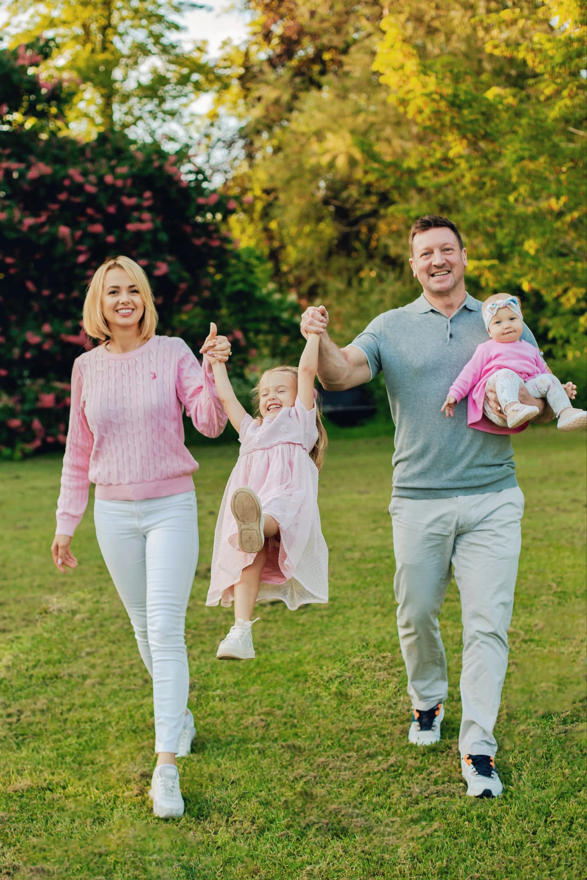
I give meticulous attention to skin tone in every portrait — ensuring warm, flattering, natural colour that makes you look your radiant best, regardless of the lighting conditions on the day.
Book your session and see your most beautiful self in every image →