Split toning applies different colour tones to the shadows and highlights of an image independently — warm gold in the highlights and cool blue in the shadows, for example. It is one of the most powerful colour grading techniques in photography, used extensively in film emulation, fine art portraiture, landscape photography, and cinematic colour work. This guide covers the theory, the tools, and the creative application of split toning across genres.
The Principle
In a standard photograph, shadows and highlights share the same colour temperature. Split toning breaks this relationship, applying one hue to the dark tones and a different hue to the light tones. This creates colour contrast — complementary colour pairs (blue shadows/orange highlights, teal shadows/warm highlights) are the most common and visually effective. The result is an image with depth, dimension, and a cinematic quality that neutral colour grading cannot achieve.
History
Split toning originates from darkroom chemical processes. Selenium toning shifts shadows toward cool purple-blue while leaving highlights neutral. Sepia toning warms the highlights. Chemical split toning combined two baths to achieve dual-tone results. In the digital age, split toning is applied non-destructively in Lightroom, Photoshop, Capture One, or any colour grading tool, with precise control over hue, saturation, and balance.
Split Toning in Lightroom / Camera Raw
In Lightroom Classic and Camera Raw, the Color Grading panel (formerly Split Toning) provides three colour wheels — Shadows, Midtones, and Highlights — plus a Global wheel. Each wheel lets you choose a hue and saturation. The Balance slider shifts the boundary between shadows and highlights, controlling which tones receive which colour. The Blending slider controls how smoothly the shadow and highlight tones merge in the midtones.
Step-by-Step Workflow
- Complete your basic exposure, white balance, and contrast adjustments first. Split toning is a finishing step.
- Open the Color Grading panel. Start with the Highlights wheel — drag the dot toward the desired highlight tone (gold, peach, warm orange are popular).
- Move to the Shadows wheel — drag toward the complementary shadow tone (teal, blue, cool purple).
- Adjust saturation for each — subtle is usually better. 10-25% saturation is a good starting range.
- Use the Balance slider to shift the split point. Drag right to push more of the image toward the highlight tone; left for more shadow tone.
- Optionally, add a midtone colour for a three-way grade.
Popular Colour Combinations
- Teal and orange: The cinematic standard. Teal in shadows, warm orange in highlights. Creates a Hollywood blockbuster colour palette — skin tones glow warm against cool blue environments.
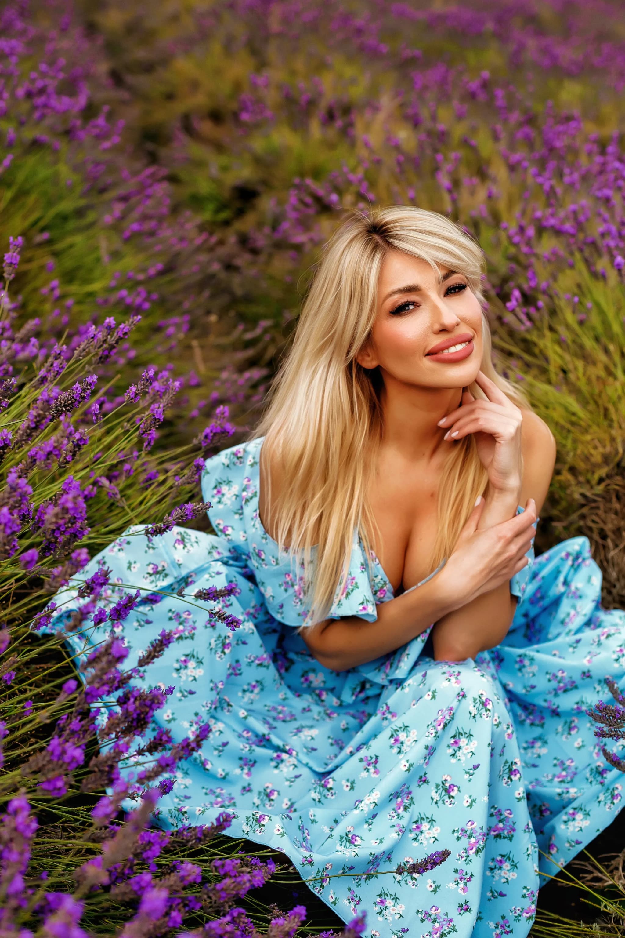
- Blue and gold: A more subtle variation of teal/orange. Evocative, romantic, and widely used in wedding and portrait photography.
- Purple and yellow: Dramatic and slightly surreal. Purple shadows with warm yellow highlights suggest sunset light or vintage film stock.
- Green and magenta: Unusual but striking. Green shadows with warm magenta highlights create an editorial, fashion-forward look.
- Sepia monotone: Same warm tone in both shadows and highlights but at different intensities — creates a classic vintage feel without the harshness of a full sepia filter.
Split Toning for Black-and-White Images
Split toning is particularly effective on black-and-white conversions. Selenium-style toning (cool purple shadows, neutral highlights) adds depth and archival character. Sepia-blue split (warm highlights, blue shadows) creates a rich, dimensional monochrome. Because there is no competing colour information, even subtle split tones are clearly visible and impactful.
Advanced: Colour Grading with Curves
For more precise control, use the tone curves in individual colour channels (Red, Green, Blue). Lifting the blue channel curve in the shadows adds blue to the shadows; pulling it down in the highlights adds yellow (the complement of blue) to the highlights. The same principle applies to the red and green channels. This method is more precise than the Color Grading wheels and allows for non-linear toning — different amounts of colour shift at different tonal levels.
Common Mistakes
- Oversaturation: The most common error. Split toning should be felt, not seen. If the colours are immediately obvious, reduce saturation.
- Clashing skin tones: Shadow tones that clash with skin (green, heavy blue) can make portraits look sickly. Always check skin rendering after applying split toning.
- Ignoring the base image: Split toning works best on well-exposed, well-contrasted images. Applying it to a flat, underexposed image amplifies the weaknesses.
- One grade for everything: Different images benefit from different grades. A moody landscape and a bright portrait need different approaches — save presets but adjust per image.
Split toning is the difference between a photograph and a mood. It is the finishing touch that transforms technically correct images into emotionally resonant ones — colour as feeling, not merely information.
Master colour grading, master emotion. Explore the portfolio.