What to Wear for Summer Photography Sessions: A Complete Outfit Guide
Clothing is one of the most significant variables in outdoor portrait photography — and in summer, it interacts with the season in very specific ways. The rich greens, warm light, and outdoor settings of a summer session all affect how colours and textures translate into images. This guide covers what works, what to avoid, and how to coordinate a family without ending up in a matching-outfit photograph that looks forced.
Colours That Work in Summer Settings
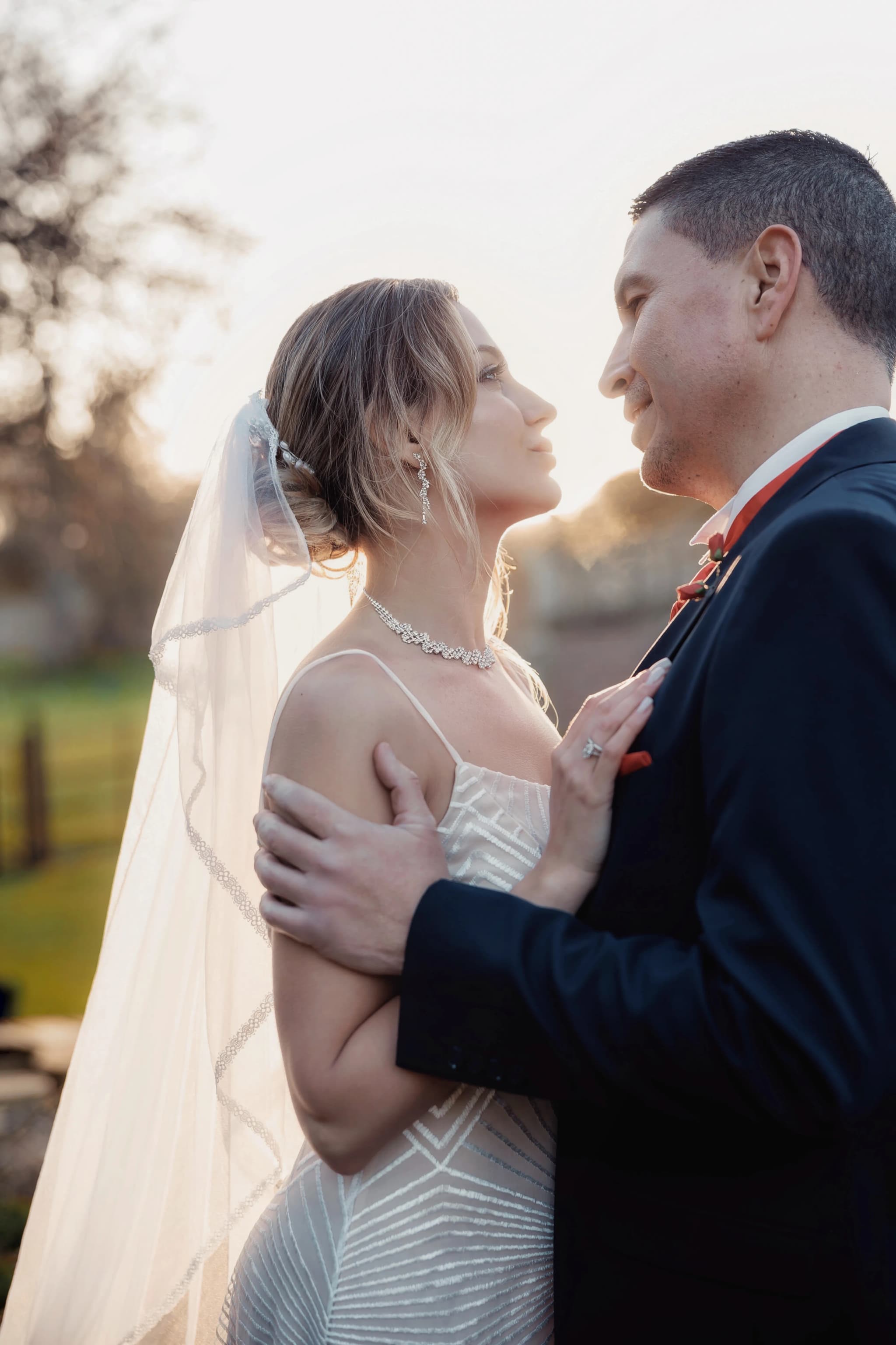
Summer landscapes are dominated by deep, saturated greens. The background in most outdoor summer sessions will have significant greenery — trees, grass, hedgerows, wildflowers. This means that clothing in similar greens can create unwanted camouflage, while colours that contrast naturally with the landscape tend to make subjects read clearly.
Colours that reliably work well against summer green backgrounds:
- Warm white and cream — Fresh without being harsh, particularly in golden light which adds warmth to white tones
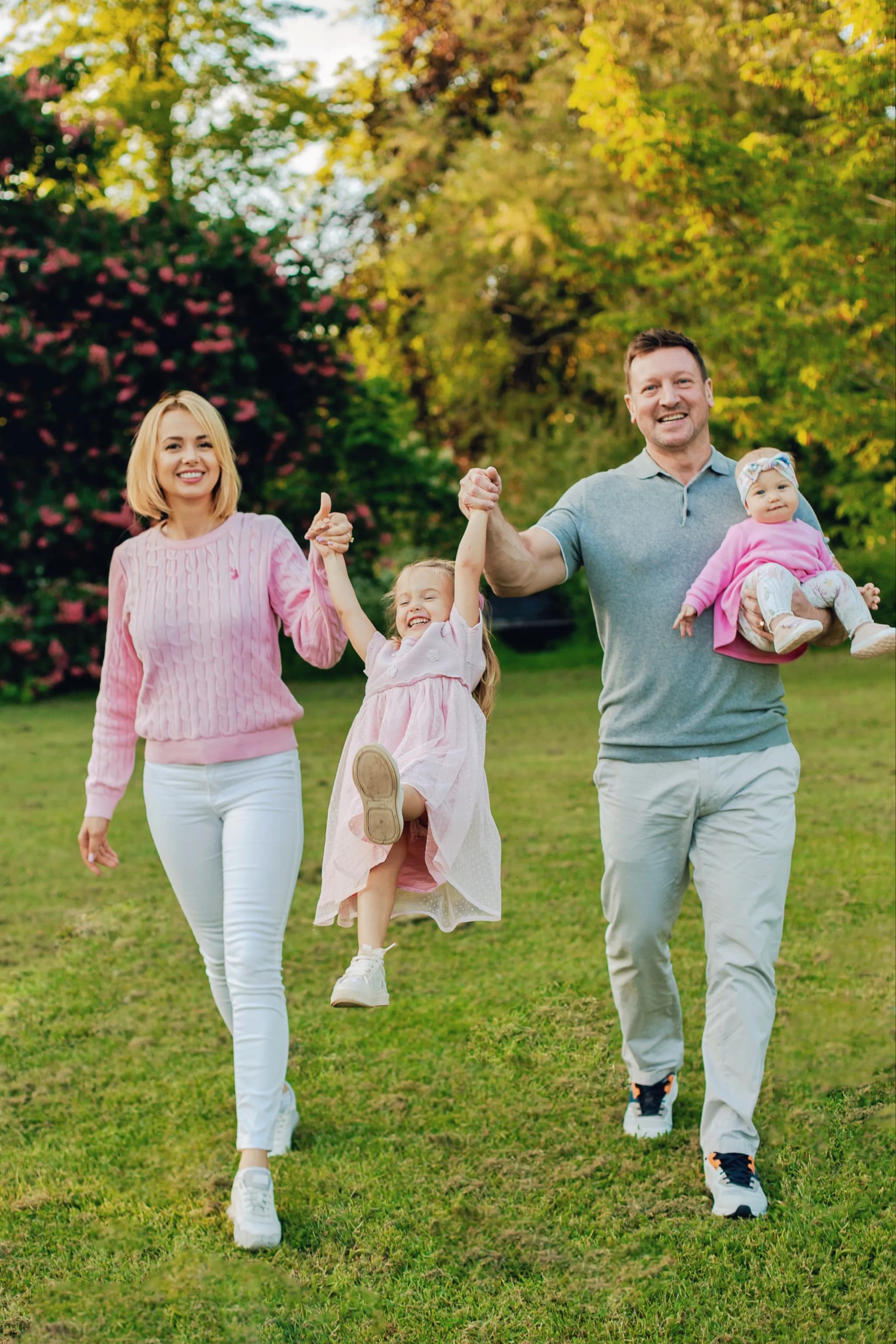
- Dusty rose and soft pink — Sits beautifully against green; reads as warm without dominating
- Sage green — Technically green, but muted enough to work as a neutral and coordinate with bolder colours in a family group
- Terracotta and burnt orange — A bolder choice that photographs richly in golden light, particularly in late June and July
- Pale yellow and warm gold — Picks up and amplifies the golden tones of evening light beautifully
- Warm tan and sand — Neutral and natural, reads well in all summer light conditions
- Soft denim blue — A classic that works in outdoor settings, particularly for casual family sessions
Colours to Approach with Care
Not forbidden — but these require thought:
- Bright white — Can blow out (overexpose) in strong directional light, losing texture and detail. Soft or off-white is more forgiving than pure bright white.
- Black — Can look heavy and flat in warm golden-hour light, and tends to lose detail in evening shadows. A better choice for morning sessions with cooler light.
- Bright primary red — Very strong against green backgrounds; tends to dominate the image. Softer reds like burnt red or brick work better.
- Neon or fluorescent colours — Almost never work in natural light outdoor portraits. They photograph harshly and compete with everything.
- Emerald or bright green — Can disappear into lush summer backgrounds. If green is worn, make sure there is enough contrast in tone with the background.
Fabrics and Practicality
Summer outdoor sessions — particularly evening sessions in warm weather — have specific practical requirements that affect fabric choice:
Natural fabrics breathe, which matters when you are outside on a warm evening for 30 to 60 minutes. Linen, cotton, and lightweight wool all allow air circulation. Synthetic fabrics retain heat and can make subjects visibly uncomfortable, which shows in expressions and energy levels.
Movement matters. Flowing fabrics — a linen dress, a floaty skirt — catch light and move beautifully in a summer breeze. Stiff or structured fabrics look formal in outdoor settings and don't contribute the same sense of ease.
Layers are useful even in summer. Evening temperatures can drop after a warm day. A light denim jacket or cardigan kept in a bag allows individuals to adjust during the session without derailing the palette.
Coordinating a Family Group
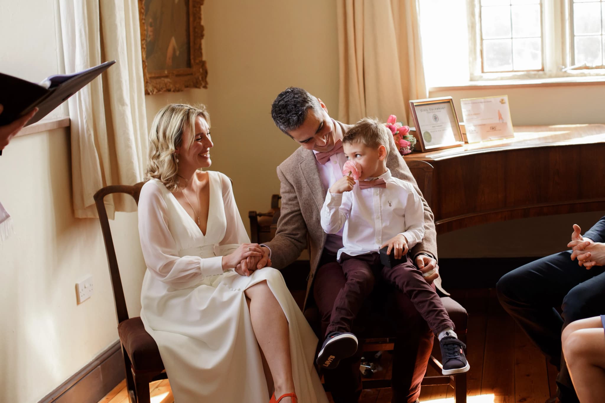
The most common mistake in family portrait clothing is attempting to match perfectly. Identical outfits look staged; slight variations in a shared palette look natural. The aim is visual coherence — the group looks considered — without looking like they are wearing a uniform.
A practical approach: choose three colours within the same palette (for example: cream, dusty rose, and warm tan). Assign each person or couple one of those tones. Children can mix and match within the palette. The result is a group that reads as cohesive in the image without any component looking contrived.
Avoid: one person in a strong patterned print while everyone else is in plain tones. The patterned person will draw the eye in every image regardless of whether that is the intention.
Children's Clothing Specifically
Practical considerations are highest for children's clothing:
- Choose comfortable clothing they have worn before — a child in stiff or scratchy new clothes will be distracted by that throughout the session
- Allow room to run and move — restrictive or very formal clothing limits the naturally active, candid images that summer sessions produce best
- Bring a change of top for young children in case of pre-session spillage
- Darker colours on the bottom half of a child hides grass stains acquired during the session itself — inevitable with outdoor children's photography
A Note on Patterns and Prints
Small patterns — small-scale floral, fine stripe, subtle check — can work well in family portraits. Large, high-contrast patterns (bold stripes, graphic prints, large logos) tend to compete with the image in a way that a viewer's eye finds busy. As a rule: the simpler the clothing, the more clearly the people in it read. The season and the light are already providing visual interest; clothing does not need to add more.
The aim is for the viewer looking at the image to notice the people first — their expressions, their interaction, the warmth of the light — and barely register what they are wearing. When clothing achieves that kind of visual quietness, it has done its job perfectly.