Tone Curve Mastery in Photography: The Complete Guide to Point Curves, Parametric Curves, RGB Channel Adjustments, Film Emulation, and Professional Tonal Control
The tone curve is the single most powerful tonal adjustment tool in photography — more versatile than levels, more precise than brightness/contrast sliders, and capable of creating effects that no combination of basic sliders can replicate. Understanding the tone curve transforms your editing from slider-pushing into true image crafting, giving you direct control over how every luminosity value in your photograph maps to the output. From lifting shadows for a faded film look to crushing blacks for high-contrast drama, from creating precise midtone contrast to separating highlight detail, every adjustment possible with brightness, contrast, highlights, shadows, whites, and blacks sliders is ultimately a simplified version of what the tone curve can do — and the curve can do vastly more.
The horizontal axis of the curve represents the input values — the original luminosity of each pixel in the image, from pure black (left) to pure white (right). The vertical axis represents the output values — the luminosity those pixels will be mapped to after the adjustment. A straight diagonal line from bottom-left to top-right is the default curve — no change, every input value maps to the same output value. Pulling a point upward brightens the tones at that input level; pulling downward darkens them. The steepness of the curve in any region determines local contrast: a steeper curve segment increases contrast (tonal separation), while a flatter segment decreases contrast (tonal compression). This relationship between curve shape and tonal response is the fundamental concept that unlocks the full power of curve-based editing.
The Parametric Curve: Slider-Based Control
Lightroom and Camera Raw offer two curve modes: Parametric and Point. The Parametric curve provides four sliders — Highlights, Lights, Darks, and Shadows — each controlling a specific tonal range, with three adjustable region boundaries that define where each range begins and ends. This slider-based approach is easier to learn and harder to break (you cannot create extreme curves that produce banding or solarisation), making it an excellent starting point. Moving the Darks slider to the left darkens the dark tones; moving Highlights to the right brightens the highlights. The region boundaries (adjusted by dragging the vertical dividers on the histogram) let you control exactly which tones are affected.
The Parametric curve is particularly useful for establishing the overall tonal foundation of an image: pull Shadows slightly right to open deep shadows, push Darks left to deepen mid-shadow contrast, push Lights right to add luminosity to midtones, and adjust Highlights to control the brightest areas. The values are typically modest — ±10 to ±30 is sufficient for most corrections. The Parametric curve produces smooth, natural adjustments because the underlying algorithm applies gradual transitions between tonal regions, preventing the abrupt tonal shifts that can occur with poorly placed point curve control points.
The Point Curve: Precise Tonal Mapping
The Point curve provides direct, unrestricted control over the tonal response. Click anywhere on the curve to create a control point, then drag it to remap that input value to a new output value. Multiple control points allow complex tonal mappings: an S-curve (pulling shadows down and highlights up) increases contrast; a reverse S-curve decreases contrast; raising the shadow end creates a faded film look; compressing the highlight end produces a vintage print quality. Built-in presets (Linear, Medium Contrast, Strong Contrast) provide useful starting points that can be further customised with additional control points.
The targeted adjustment tool (the crosshair icon) allows you to click on any point in the image and drag up or down to brighten or darken that specific tonal value — it places a control point on the curve corresponding to the clicked pixel's luminosity and moves it as you drag. This is invaluable for precise adjustments: click on a shadow area and drag up to brighten precisely those shadow values; click on a skin midtone and drag to adjust exactly that tonal range. The targeted approach eliminates guesswork about where on the curve a particular image tone falls, making curve editing fast and intuitive even for beginners.
RGB Channel Curves: Independent Colour Control
Beyond the composite (RGB) curve that controls overall luminosity, you can edit the Red, Green, and Blue channels independently. Each channel curve controls both the luminosity and colour of a specific channel: raising the Red channel adds red (warmth), lowering it adds cyan (coolness). Raising Blue adds blue, lowering adds yellow. Raising Green adds green, lowering adds magenta. These complementary pairs (Red⬌Cyan, Green⬌Magenta, Blue⬌Yellow) are the foundation of colour grading with curves — by adjusting individual channel curves, you can create virtually any colour grade, from cool teal-and-orange cinematic looks to warm vintage film tones to subtle colour shifts that establish a signature editing style.
The most common channel curve technique for colour grading is differential shadow-highlight colour: for the classic teal-and-orange look, lift the Blue channel in the shadows (adding blue to dark tones) while pulling it down in the highlights (adding yellow/warmth to bright tones), creating complementary colour contrast between shadows and highlights. For a warm vintage look, lift the Red channel slightly in the shadows (adding warmth to dark tones), lift the Green channel very slightly in the midtones (adding a subtle green undertone), and lower the Blue channel across the full range (adding overall yellow warmth). These subtle channel adjustments — often just 3–8 units of shift on a 0–255 scale — create significant perceived colour change because the human eye is extremely sensitive to small colour shifts in neutrals.
Film Emulation with Tone Curves
Film stocks have characteristic tone curves that produce their distinctive looks: Kodak Portra has a gentle highlight rolloff with warm midtones; Fuji Pro 400H has a slightly cool, open shadow character with fine-grained highlights; Ilford HP5 has a punchy midtone contrast with smooth highlight compression. These characteristics can be emulated — not exactly replicated, but convincingly approximated — using combinations of the composite curve and channel curves. The key film characteristics to emulate are: shadow lifting (film holds shadow detail longer than digital, creating an open, low-contrast shadow quality), highlight compression (film rolls off highlights gradually rather than clipping them abruptly), and the specific colour biases in shadows, midtones, and highlights.
For a Portra-style look: on the composite curve, lift the absolute black point slightly (+8 to +12), add a gentle S-curve with modest midtone contrast, and compress the top end slightly (pull the absolute white point down -5 to -10). On the Red channel, add a tiny lift in the midtones (+3 to +5). On the Blue channel, pull down the shadows slightly (-5 to -8) for yellow undertones in the dark tones. The result is a warm, gently faded quality with open shadows and soft highlights — the hallmarks of the Portra aesthetic. For a Fuji 400H look: similar shadow lifting, but on the Blue channel, add a slight lift in the shadows (+3 to +5) and midtones (+2 to +4) for the blue-green coolness that defines Fuji's rendering. These are starting points — refine to taste while viewing at full-screen to Judge the overall colour balance.
The S-Curve: Photography's Most Important Tonal Adjustment
The S-curve is the single most frequently used curve adjustment in photography because it increases contrast in the most visually pleasing way: it deepens shadows, brightens highlights, and steepens the midtone transition — creating punchier, more vivid images that the human eye perceives as sharper and more three-dimensional. A mild S-curve (with control points at roughly the 25% and 75% tonal positions, shifted ±5 to ±10) adds subtle snap to a flat RAW file; a strong S-curve (shifted ±15 to ±25) creates dramatic, high-contrast impact suitable for black-and-white conversions and editorial fashion looks.
The shape of the S-curve matters as much as its strength. A symmetrical S-curve increases contrast equally in both shadows and highlights. An asymmetrical S-curve — a stronger pull in the shadow region than the highlight region, or vice versa — shifts the contrast emphasis to one side of the tonal range. For portraits, an asymmetrical S-curve that gently deepens shadows while slightly compressing highlights produces flattering skin tones: the shadow depth adds dimension and sculpting, while the highlight compression prevents bright skin areas from blowing out or looking harsh. For landscapes and architecture, a symmetrical or slightly highlight-biased S-curve works better, maximising the drama and depth in the sky while maintaining deep foreground shadows.
Curve Editing in Capture One
Capture One provides one of the most sophisticated curve tools in any photo editing application, with several unique capabilities. The Luma curve adjusts luminosity without affecting colour saturation — unlike RGB curves that can cause colour shifts when adjusting brightness (brightening a saturated red with the RGB curve adds more red light, increasing saturation, while the Luma curve brightens without colour shift). Capture One also offers separate curves for RGB, Red, Green, Blue, and Luma — plus the ability to apply curves to specific layers for localised tonal control. For colour-critical work, the Luma curve combined with channel curves provides the cleanest, most predictable colour grading results.
Capture One's curve tool also includes a unique feature: the ability to draw custom curves freehand, which advanced colourists use to create highly specific tonal mappings for critical colour work. Combined with Capture One's floating-point processing pipeline and superior colour science (particularly its film simulation profiles and ICC profile handling), the curve tools in Capture One are often preferred by professional retouchers and commercial photographers who need absolute precision in tonal and colour control — especially for tethered studio work where colour consistency across a large shoot is paramount.
Masterful Tonal Work in Every Image
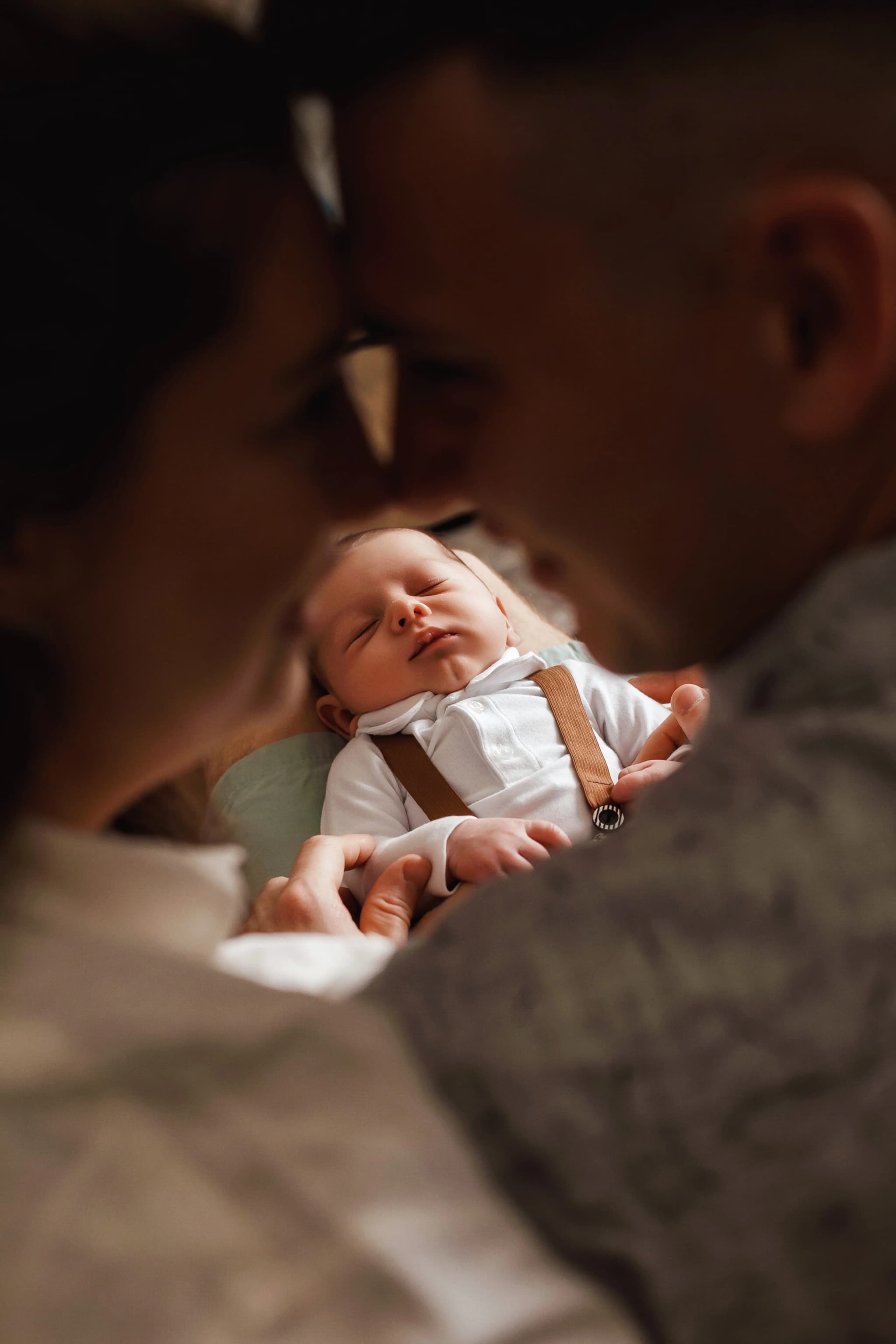
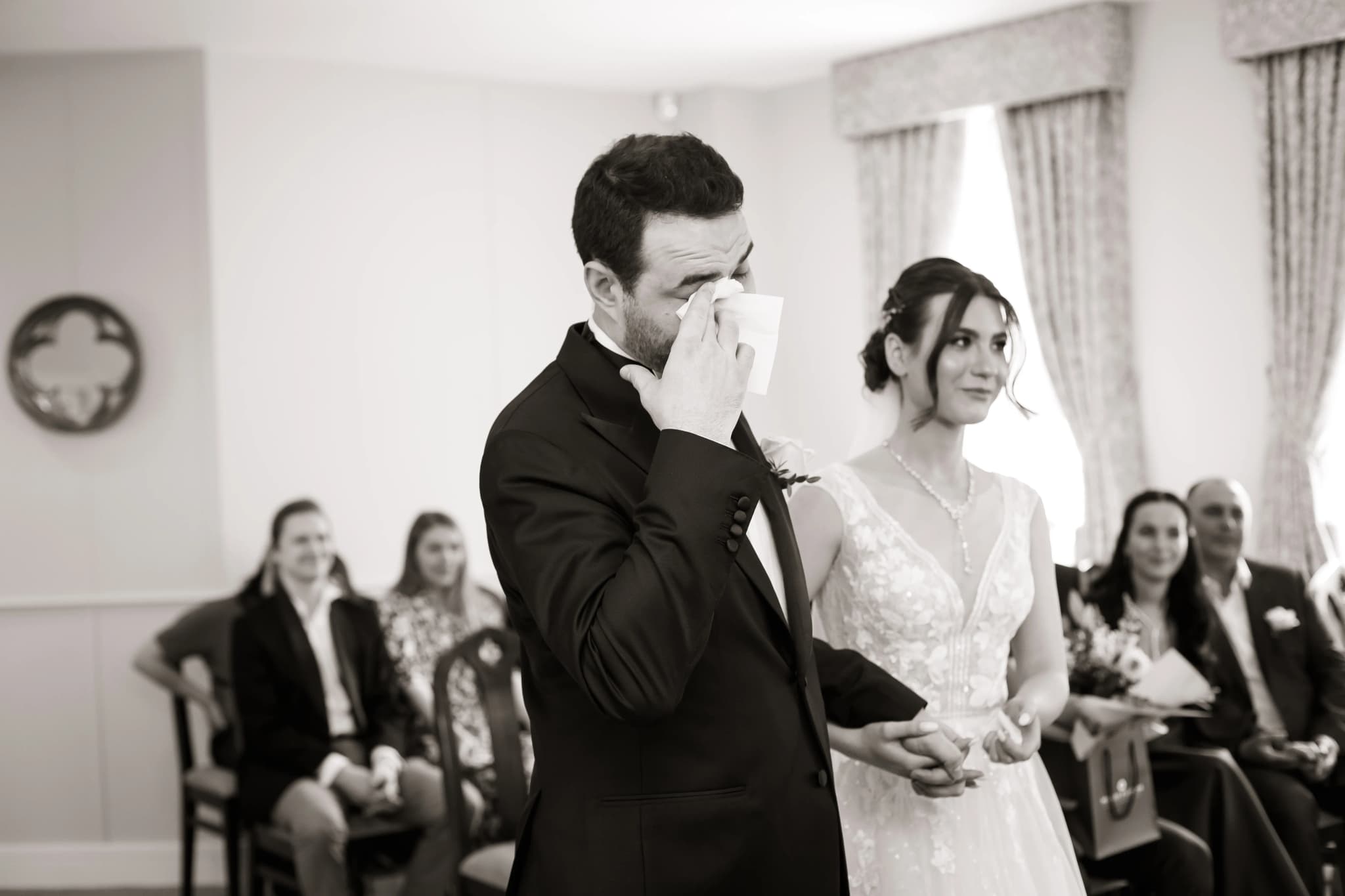
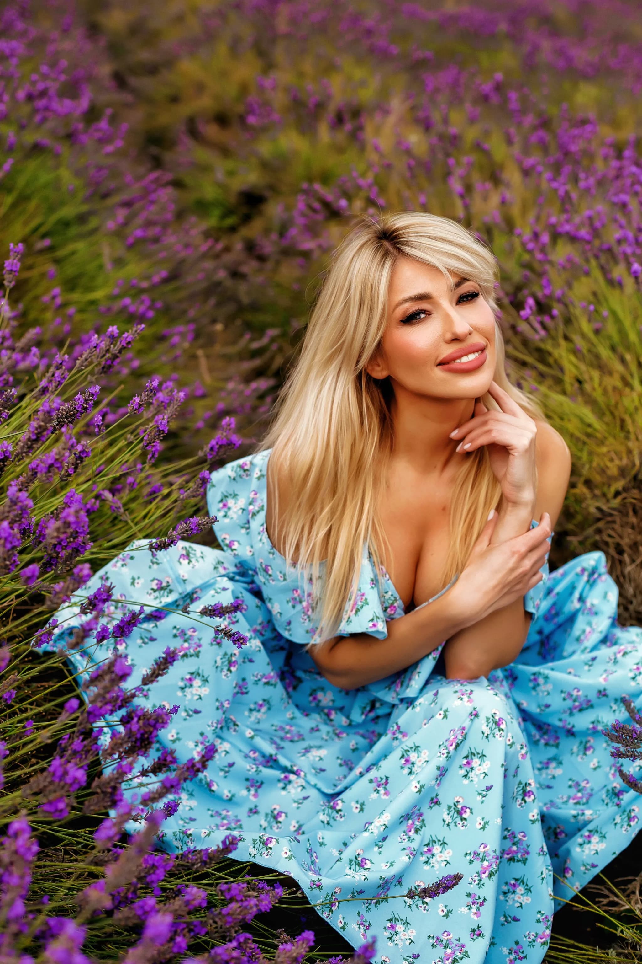
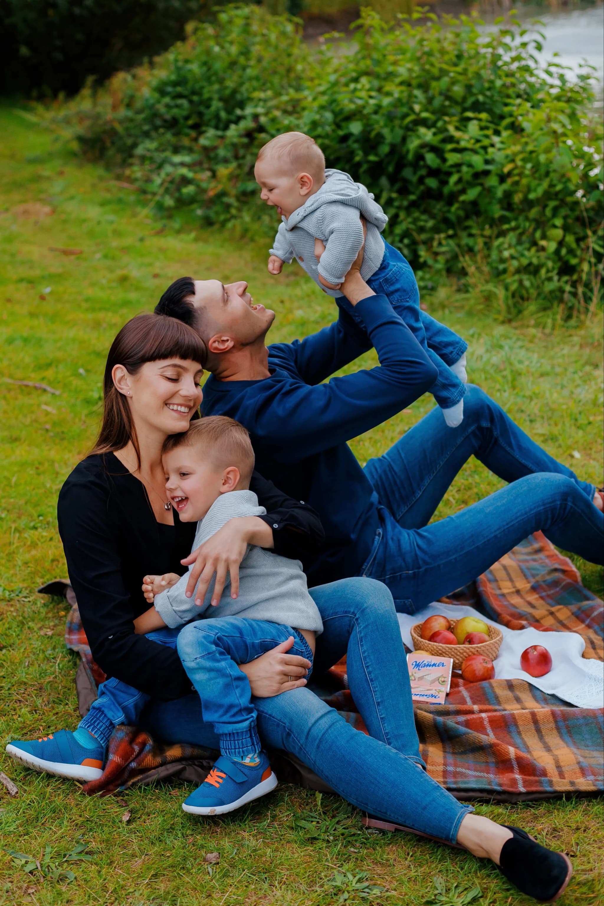
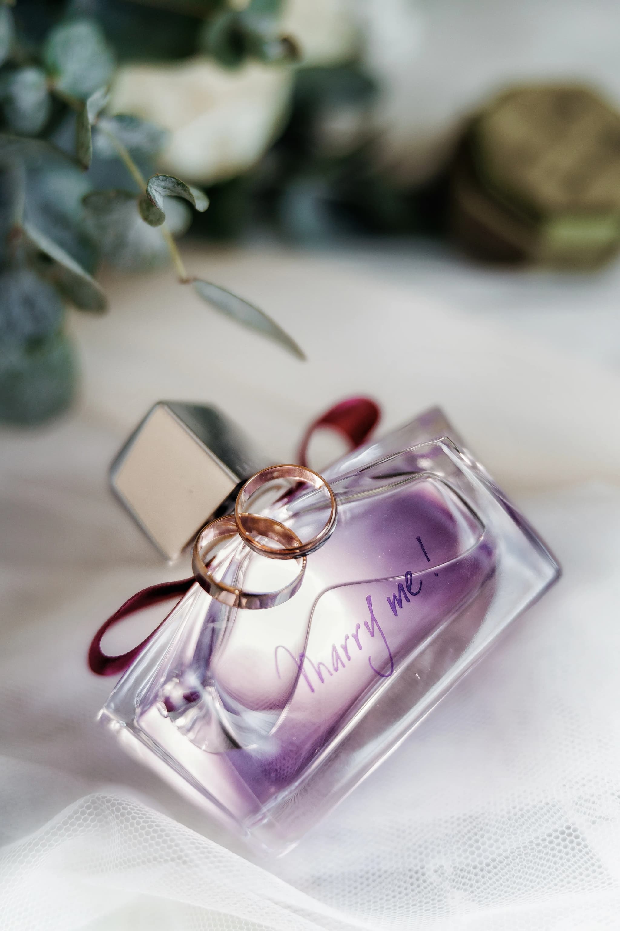
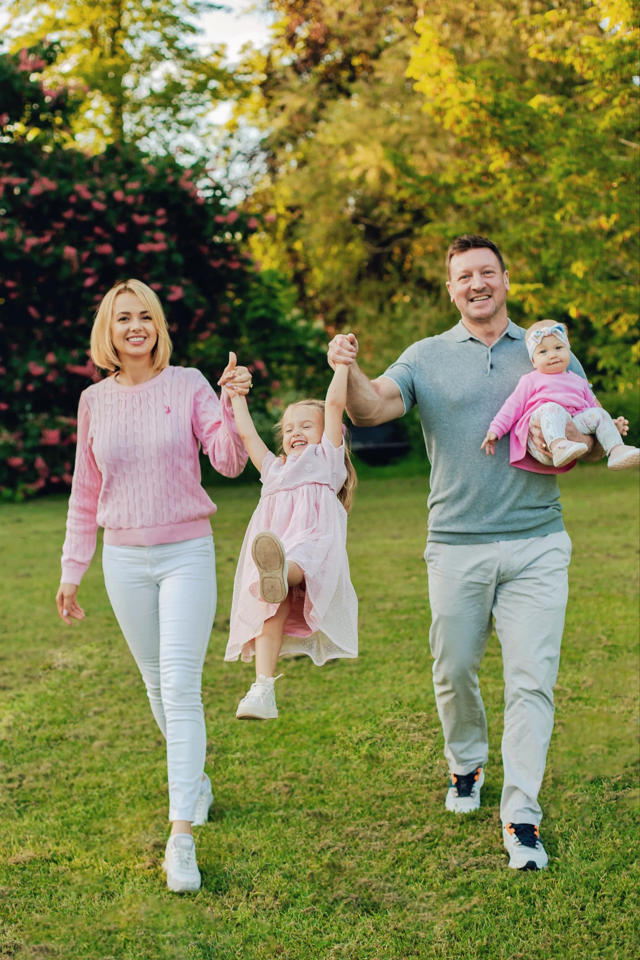
Every photograph I deliver has been carefully graded with precision curve adjustments — creating rich, dimensional, beautifully toned images that elevate your portraits and wedding photographs into gallery-quality art.
Book your session and experience professional-grade tonal artistry →