Yana Skakun
Light & natural: Understanding a photographer's editing style
By Yana Skakun·1 September 2026·7 min read
When photographers describe their work as "natural" or "light and airy", those phrases sound like marketing until you understand what they actually mean technically. Editing style is not a filter applied at the end to make photographs look nicer — it is a set of deliberate, repeatable decisions that shape colour, contrast and tone across every single image a photographer delivers. Understanding what those decisions involve is genuinely useful before you book anyone, because it tells you far more about how your photographs will actually look than any single sample image can.
What Editing Style Actually Determines
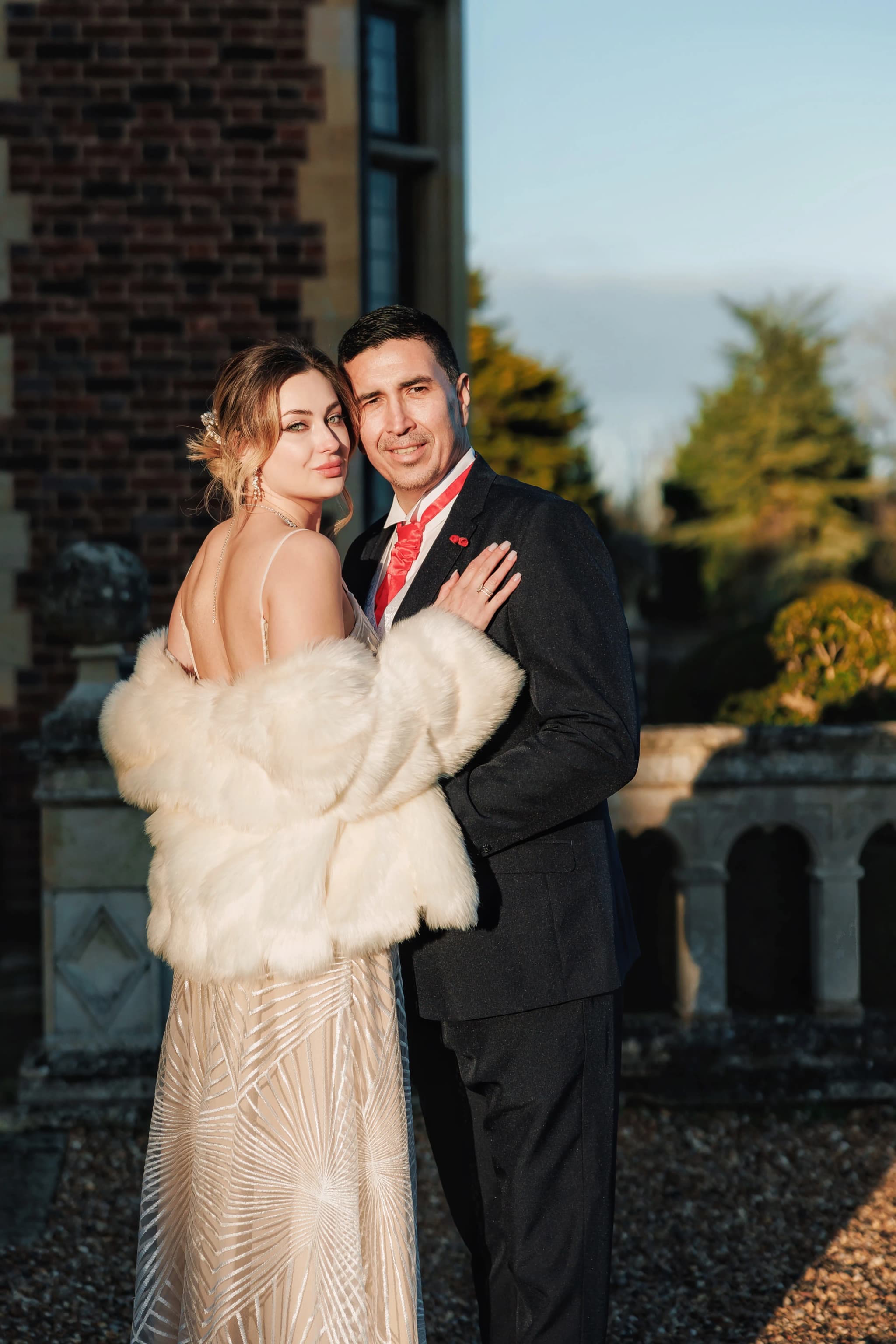
Every digital photograph is processed after it is taken — that processing is what photographers mean by editing or post-production. The choices made during that process determine a handful of specific things: colour temperature, meaning whether the image reads warm or cool; contrast, meaning whether the tonal range is flat and gentle or punchy and graphic; skin tone rendering, meaning whether skin looks peachy and warm, strictly neutral, or deliberately desaturated; how much detail is preserved or lifted in the shadows; and how highlights roll off, whether they blow out to pure white sharply or fade gradually. Two photographers working in the exact same light, on the same day, photographing the same scene, can produce results that look completely different from each other purely through these editing choices.
This is why looking only at a photographer's single best images, shared in isolation on social media, tells you very little. The editing decisions only become visible when you look at a full body of work, because that is where the consistency — or the lack of it — actually shows up.
What "Natural and Timeless" Actually Means
Natural editing means the final image looks close to how the scene genuinely appeared in that light, to your own eyes, standing there. No orange or overly tanned skin, no shadows crushed so heavily that detail is lost entirely, no artificial grain layered on for texture's sake, no heavy haze or fog effect laid over the whole frame. It is a restrained approach, and restraint is harder to achieve consistently than it looks, because it means resisting the urge to make every single image dramatic.
Timeless means something slightly different: avoiding editing trends that date quickly, even if they look striking at the moment they are fashionable. Wedding and portrait photography has been through several distinct editing fashions over the past decade or so — the heavy desaturation and faded shadows that were everywhere around 2013, the teal-and-orange colour grade borrowed from cinema that dominated around 2016, and the extreme brightness and near-white highlights that became popular in parts of the wedding industry around 2018. Photographs edited in any of those styles now read, quite obviously, as belonging to that specific year, in the same way a haircut or a piece of clothing can date a photograph.
Editing that avoids chasing those trends does not look exciting in the way a heavily stylised trend does at the time. It looks, instead, like an accurate, well-exposed, well-composed photograph of the actual moment. That is precisely the point. A wedding photograph is something you look back on for decades, and an image edited to look timeless in 2026 should still look like a genuine, un-dated photograph of your wedding day in 2046.
How I Actually Edit a Wedding Day
Every photograph I deliver starts as a RAW file, which captures far more tonal and colour information than a JPEG and gives genuine room to recover shadow and highlight detail without the image falling apart. A JPEG bakes in the camera's own processing decisions at the moment of capture and discards the rest of the data permanently, which means there is very little room left to correct a mistake in white balance or to hold onto detail in a bright window or a dark church interior. Shooting RAW is slower and produces far larger files to store and back up, but it is the only way to have real control over the final look rather than being stuck with whatever the camera guessed in that instant.
A typical wedding produces several thousand RAW files across the day. The first pass is a cull, removing duplicates, test frames, blinks, and anything that is technically unusable, which usually brings the number down to somewhere around six to eight hundred images that actually tell the story of the day. This culling stage matters more than people realise, because a gallery padded out with near-identical or weak frames dilutes the images that actually deserve attention, and it is far better for a couple to receive seven hundred genuinely strong photographs than fifteen hundred images of mixed quality.
From there, I work in batches grouped by lighting condition rather than editing every image individually from scratch. Getting-ready shots in a hotel room, the ceremony, the drinks reception outdoors, and the evening reception under artificial light are all lit completely differently, so I build a base adjustment for each lighting situation first — correcting white balance and setting the overall exposure and contrast baseline — and then apply that consistently across every image shot in that setting before making individual refinements. This is what actually makes a gallery of eight hundred images look cohesive rather than like eight hundred separate decisions: the vast majority of the heavy lifting happens at the batch level, with individual tweaks layered on top only where a specific frame genuinely needs it, such as a shaft of direct sun crossing one face in an otherwise evenly lit sequence.
Skin tone consistency is the part I am most exacting about, because it is the detail people notice even when they cannot articulate why. I check skin rendering against the same reference points across the whole gallery, so a bride photographed in morning window light and again on the dance floor under string lights still reads as recognisably the same warm, natural skin tone in both images, rather than shifting orange in one and grey in the other. Getting this right across a full day that moves through daylight, shade, golden hour and artificial evening light is genuinely one of the hardest parts of wedding editing, and it is the single biggest reason a full gallery takes real time to complete properly rather than being something that can be rushed through in an afternoon.
A note on seeing this in practice
The best way to judge an editing style is to look at full galleries rather than a handful of hand-picked highlights, since consistency is exactly what a curated sample cannot show you. If you would like to see complete wedding or portrait galleries edited this way, or want to talk through what this approach would mean for your own photographs, I would be glad to hear from you.
Get in touchHow Colour Grading Quietly Shapes Mood
Colour grading is the layer of editing that sits on top of basic correction and pushes an image toward a particular feeling, and it works far more subtly than most people assume. A slight warmth pushed into skin tones and midtones makes a portrait feel intimate, soft and inviting — the visual equivalent of candlelight. Cooler, more neutral tones read as clean and editorial, closer to the look of a magazine spread than a family album. Neither approach is more correct than the other; they simply produce different emotional registers, and a good editing decision matches the grade to the actual mood of the moment being photographed rather than applying the same grade to everything regardless of content.
The best colour grading, in my experience, is the kind you do not consciously notice. It enhances the atmosphere and the quality of light that was genuinely present at the time rather than imposing a mood that was not actually there. When you look through a photographer's portfolio and feel a consistent emotional thread running through it without being able to say exactly why, that feeling is usually the product of careful, invisible colour grading rather than any single dramatic edit.
Why Consistency Matters More Than the Specific Style
The most useful question to ask when looking at a photographer's work is not whether they edit warm or cool, bright or moody. It is whether they edit consistently. A portfolio that jumps between cool blue-toned portraits, heavily grain-filtered black-and-white frames, and warm orange-toned images within the same gallery signals an inconsistent process, and in my experience that inconsistency very often means the handful of striking images shown in a portfolio are not representative of the full gallery a client actually receives. Consistency across an entire delivered set is the clearest practical signal of a controlled, deliberate editing process rather than a lucky handful of standout frames.
This is also where a lot of client misconceptions come from. People sometimes assume "editing" means heavy retouching — smoothing skin, reshaping bodies, removing anything considered imperfect. In a natural, timeless approach, editing means almost none of that. Minor, temporary blemishes are sometimes softened and stray flyaway hairs occasionally tidied, but skin texture, body shape and the genuine character of a face are left alone, because the goal is an accurate, flattering record of how you actually looked on the day, not a fabricated version of it. Editing and retouching are not the same thing, and more of one does not automatically mean more of the other — a heavily graded, moody image can have zero retouching on the person in it, while colour and tone shape the overall feeling of a photograph and retouching alters the person or scene within it. I keep the two separate deliberately, applying a consistent, restrained grade across everything while doing very little to the people themselves.
Understanding that distinction, and being able to see it demonstrated consistently across a full gallery rather than a single edited highlight, is the real test of whether an editing style will still feel honest and true to you when you look back at these photographs in ten or twenty years. Photographs edited to chase a passing trend tend to embarrass their owners within a few years, in the same way an over-processed portrait from an earlier decade can now look faintly comic rather than timeless. A natural, restrained approach ages the way the moment itself deserves to age — quietly, and without drawing attention to the editing at all — which is exactly why I am always happy to get in touch and talk through full galleries with anyone considering booking.
Yana Skakun
Photographer · England
Professional wedding, family and portrait photographer based in England. Passionate about capturing authentic emotions and timeless moments.
About Yana →photographer editing stylenatural editing photographylight airy photography stylehow photographers edit photoswedding photography editing explained
Photography Tips — Professional Photography in Cambridge & England
Yana Skakun is a professional photographer based in Cambridge, specialising in wedding, family, and portrait photography across England. Every session is personal — planned around your story, your people, and the moments that matter most. This guide — Light & natural: Understanding a photographer's editing style — is part of the photography journal: practical, experience-based advice drawn from real sessions across England. Whether you arrived searching for photographer editing style or natural editing photography, the same care and attention shapes every session Yana photographs.
Professional Photography sessions are available year-round, with bookings open across Cambridge, Ely, Huntingdon, Peterborough, and further afield — East England, London, the Midlands, and beyond. If you have specific questions about light airy photography style, mention it in your enquiry. Get in touch through the contact form above to check availability and discuss your session. Enquiries are welcomed from anywhere in the UK.
Frequently Asked Questions
What camera settings should I use for outdoor portraits?+
For outdoor portraits, shoot in aperture priority mode. Use a wide aperture (f/1.8–f/2.8) to blur the background and isolate your subject. Keep ISO as low as possible in good light. In bright conditions, use a neutral density filter or switch to manual to avoid overexposure at wide apertures.
What is the golden hour in photography?+
Golden hour is the period roughly 30–60 minutes after sunrise and before sunset. The sun is low in the sky, producing warm, soft, directional light that flatters skin tones and creates beautiful long shadows. It's widely considered the best natural light for portrait and outdoor photography.
How do you get sharp photos in low light?+
In low light, increase your ISO (accepting some grain), use the widest aperture your lens allows, and slow your shutter speed to the slowest you can hand-hold without camera shake (roughly 1/focal length as a guide). Use image stabilisation if available, and consider a tripod for static subjects.
What is the rule of thirds in photography?+
The rule of thirds divides the frame into a 3×3 grid. Placing your subject on one of the four intersection points — rather than dead centre — creates a more dynamic, visually interesting composition. It's a guideline, not a rule: some of the most powerful images break it deliberately.
How do you edit photos to look professional?+
Professional editing starts with shooting in RAW format. In Lightroom or similar software, correct exposure, white balance, and contrast first. Recover shadow and highlight detail. Apply gentle colour grading for mood. Be conservative with skin retouching — the goal is natural enhancement, not transformation. Consistency across a set of images is what separates professional from amateur editing.
Continue Reading
Related Articles

Photography Tips
Photography Gift Vouchers: The Most Personal Present You Can Give
5 min read · Read Article
Photography Tips
Photo Books vs Photo Albums: What Is the Difference and Which Is Better?
5 min read · Read Article
Photography Tips
Photo Gift Ideas: Turning Professional Images into Meaningful Presents
5 min read · Read Article
Get in Touch
Ready to Book Your Session?
Get in touch to discuss your vision — I'll reply within 24 hours.