Colour Grading in Photography: The Complete Guide to Creative Colour, Split Toning, and Cinematic Colour Science
Colour grading is the art and science of deliberately adjusting the colours in a photograph to create a specific mood, atmosphere, or aesthetic that goes beyond simple colour correction. While colour correction aims to make an image look accurate — neutral whites, accurate skin tones, and balanced colour temperature — colour grading deliberately departs from accuracy to achieve an expressive, stylistic result. It is the difference between making a photograph look correct and making it feel a certain way. Warm, golden tones evoke nostalgia and intimacy; cool, desaturated blues suggest melancholy or isolation; rich teals and oranges create a cinematic drama that viewers immediately associate with high-end film production. Colour grading is one of the most powerful creative tools available to photographers, capable of transforming the emotional register of an image more profoundly than any compositional crop, exposure adjustment, or filter.
The language and techniques of colour grading originate in the cinema industry, where colourists have shaped the visual character of films since the earliest days of colour motion pictures. Digital intermediate (DI) colour grading — the process of manipulating colour digitally during post-production — became standard practice in cinema during the early 2000s and rapidly migrated to still photography as tools like Adobe Lightroom, Capture One, and DaVinci Resolve made similar capabilities available to photographers. Today, colour grading is a fundamental component of every professional photographer's post-processing workflow, used by wedding, editorial, fashion, portrait, landscape, and fine art photographers to create distinctive visual signatures that define their brand and visual identity.
The Colour Wheel and Complementary Colour Theory
Effective colour grading begins with understanding the colour wheel and the relationships between colours. The RGB colour model defines three primaries (red, green, blue) and their complementary opposites (cyan, magenta, yellow). Colours opposite each other on the wheel are complementary — they create maximum visual contrast when placed together and produce a neutral grey when mixed equally. The most popular colour grading palettes exploit complementary relationships: teal-and-orange (the dominant Hollywood colour grade, used because teal and orange are near-complements and because human skin falls in the warm/orange region, making it stand out against a teal-graded environment), blue-and-gold (similar to teal-orange but with deeper saturation, common in fantasy and historical genres), and green-and-magenta (frequently seen in horror and psychological thriller aesthetics).
Analogous colours — those adjacent on the colour wheel — create harmonious, unified grades. A warm grade using reds, oranges, and yellows produces a cohesive, intimate feeling. A cool grade using blues, cyans, and greens creates a calm, contemplative atmosphere. Triadic colour schemes (three colours equally spaced on the wheel) produce vibrant, complex grades that are harder to execute tastefully but striking when done well. Understanding these relationships before opening the grading tools helps you make intentional choices rather than randomly shifting sliders until something looks appealing. Every effective colour grade is built on a deliberate colour relationship, even if the photographer chose it intuitively rather than analytically.
Split Toning: Shadows and Highlights
Split toning — applying different colour casts to the shadows and highlights of an image — is the foundational technique of photographic colour grading. In Lightroom and Camera Raw, the Colour Grading panel (formerly Split Toning) provides three colour wheels: Shadows, Midtones, and Highlights. Each wheel allows you to shift the colour of that tonal range independently. The classic approach is to push the shadows toward a warm colour (orange, amber, or brown) and the highlights toward a cool colour (blue, teal, or lavender), or vice versa. This creates complementary colour contrast within the tonal structure of the image — the shadows and highlights are different colours, which produces visual depth and complexity.
The Balance slider controls the transition point between shadow and highlight toning. Shifting the balance toward shadows expands the shadow-toned region into the midtones; shifting toward highlights expands the highlight-toned region. The Blending slider controls how much the shadow and highlight tones overlap in the midtone region — high blending creates a smooth, seamless transition between the two tones; low blending creates a more distinct separation where the midtones remain relatively neutral and the colour shifts are concentrated in the shadows and highlights. For most photographic applications, moderate-to-high blending produces the most natural-looking results. Low blending works well for dramatic editorial or cinematic grades where distinct colour zones are desirable.
The Teal and Orange Grade
Teal and orange is the most widely used colour grade in both cinema and photography, and understanding why it works reveals fundamental principles of colour psychology and visual perception. The grade exploits the complementary relationship between teal (a blue-green tone, approximately 180–200° on the colour wheel) and orange (approximately 20–40° on the colour wheel). Human skin — regardless of ethnicity — falls in the warm yellow-orange-brown range, making it naturally complement teal. When a photographer grades the non-skin elements of the scene (shadows, background, ambient light) toward teal and allows the skin to remain warm or pushes it slightly toward orange, the subject's face becomes the visual anchor of the image — literally the complementary opposite of the background, creating maximum colour contrast that draws the viewer's eye directly to the subject.
To create a teal-and-orange grade in Lightroom: begin in the Colour Grading panel and push the Shadows wheel toward teal (approximately 190–200° hue, moderate saturation). Push the Highlights wheel toward warm orange (approximately 30–40° hue, low-to-moderate saturation). Adjust the Midtones toward very subtle teal or leave neutral. In the HSL panel, shift the blue and aqua hues slightly toward teal if needed, and shift the orange and yellow hues toward orange. Reduce the saturation of greens slightly to prevent competing colour elements. The final result should show warm, inviting skin tones against a cool, teal-tinted environment — cinematic, atmospheric, and immediately striking. Use restraint — heavy-handed teal-orange grades look artificial; subtle application produces the most convincing results.
Warm Film Emulation Grades
Many photographers seek to recreate the warm, nostalgic colour quality of popular film stocks — Kodak Portra 400, Fuji Pro 400H (discontinued), Kodak Gold 200, and others — in their digital photographs. These film stocks produce characteristic colour shifts: Portra adds a subtle warm cast to skin tones while keeping shadows slightly cool, Gold adds a more pronounced amber warmth throughout, and Pro 400H produces a distinctive desaturated, slightly cool-warm palette with lifted blacks. Recreating these looks digitally requires understanding the specific tonal curves and colour shifts of each stock.
For a Portra-like grade: lift the blacks slightly (raise the bottom of the tone curve to create a faded shadow look), add a gentle S-curve for moderate contrast, push the white balance slightly warm (add 200–400K), shift the tint slightly toward magenta (+3 to +5), reduce overall saturation slightly (-10 to -15), selectively desaturate greens, and add a subtle orange shift to the midtones in the Colour Grading panel. For a more saturated Gold-like grade: push white balance warmer, increase overall saturation in the warm range, add a warm shift to all three tonal ranges (shadows, midtones, highlights), and apply a stronger S-curve for punchier contrast. These grades are starting points — every photographer adapts them to their own taste and shooting conditions, which is how personal colour signatures evolve.
Desaturated and Muted Grades for Moody Photography
Desaturated, muted colour palettes have become increasingly popular in fine art, editorial, and moody wedding photography. These grades reduce overall colour intensity while shifting the remaining colour toward a specific palette — typically earthy tones (browns, olive greens, muted oranges) or cool tones (slate blues, grey-greens, muted lavenders). The result is an image that feels dreamlike, vintage, or emotionally atmospheric. The technical approach involves reducing global saturation (-20 to -40 in Lightroom), selectively preserving some saturation in warm tones (particularly skin), adding a colour shift to the shadows (toward a complementary or analogous colour), and lifting the blacks to reduce overall contrast. The lifted blacks are particularly important — they create the faded, low-contrast base that defines the moody aesthetic.
To maintain impact in a heavily desaturated grade, you need to preserve contrast and structure in other ways. Increase local contrast using Clarity or Texture sliders, which add definition to mid-frequency detail without adding colour. Use a tone curve with strong midtone contrast — a steep S-curve between the lifted shadow and the pulled-down highlight — to maintain a sense of depth even with muted colour. Pay particular attention to skin tones: in a desaturated grade, skin can easily look grey, sickly, or lifeless. Use the HSL panel to selectively maintain warmth in orange and red hues while desaturating everything else. The skin should remain the warmest, most saturated element in the image, anchoring the viewer's attention even in an otherwise muted palette.
HSL and Colour Mixer for Precise Colour Control
The HSL (Hue, Saturation, Luminance) panel — also called the Colour Mixer — provides per-colour control that is essential for refined colour grading. Each of the eight colour channels (red, orange, yellow, green, aqua, blue, purple, magenta) can be independently adjusted in hue (shifting the colour toward an adjacent colour on the wheel), saturation (increasing or decreasing the intensity), and luminance (making the colour lighter or darker). This tool has no analogue in traditional darkroom printing and represents one of the most profound advantages of digital colour work over analogue.
Practical HSL grading examples: shift blues toward teal (decrease the blue hue toward aqua) for a more cinematic sky colour. Shift greens toward yellow or olive to replace the sometimes-harsh chartreuse green of grass and foliage with a warmer, more film-like tone. Increase the luminance of orange to brighten skin tones without increasing exposure globally. Decrease the saturation of yellow to prevent golden-hour images from looking excessively saturated while maintaining warmth. Shift reds toward orange to warm up lip colour or shift magenta florals toward pink. The HSL panel is where the broadstrokes of the Colour Grading panel meet the fine detail of per-colour control — together, they give you complete authority over the colour palette of the image.
Curves for Advanced Colour Grading
The Tone Curve is the single most powerful colour grading tool in any editing application. While the RGB composite curve controls overall contrast and tonality, the individual channel curves (Red, Green, Blue) provide direct control over colour balance at every tonal level simultaneously. Pulling the Red curve up in the shadows adds red/warmth to the shadows; pulling it down adds cyan. Pulling the Blue curve up in the highlights adds blue to the highlights; pulling it down adds yellow. By independently shaping each colour channel curve, you can create infinitely complex colour grades that would be impossible with simpler tools.
The classic cross-processing look is a perfect example of a curves-based grade: in the Red channel, create a shallow S-curve (adding red to highlights, cyan to shadows). In the Green channel, create the opposite S-curve (adding green to shadows, magenta to highlights). In the Blue channel, lift the shadow point (adding blue to the deepest tones) and pull down the highlight point (adding yellow to the brightest tones). The result is the distinctive warm-highlight, blue-shadow, cross-processed aesthetic that references the look of C-41 film processed in E-6 chemistry. This look is just one of thousands of possible grades achievable through channel curves — the flexibility is essentially unlimited, which is why experienced colourists typically work primarily with curves rather than the simpler Colour Grading wheel.
Colour Grading for Consistency Across a Gallery
One of the primary professional applications of colour grading is maintaining visual consistency across a series of images — a wedding gallery, an editorial spread, a portrait portfolio, or an Instagram feed. Consistency is what transforms a collection of individual photographs into a cohesive body of work, and colour is the most immediately perceptible element of visual consistency. When a wedding gallery has a consistent colour temperature, shadow tone, highlight character, and saturation level, it looks polished and professional. When the grade varies from image to image — too warm here, too blue there, oversaturated in some, desaturated in others — the gallery looks chaotic regardless of how strong the individual images are.
The key to consistency is developing and using presets as starting points, then adjusting per image for white balance and exposure while leaving the colour grade intact. Create a base preset that applies your signature colour grade — split-tone values, HSL adjustments, tone curve shapes, saturation levels — and apply it to every image in a session as the first step. Then adjust white balance, exposure, and contrast per image to account for varying lighting conditions. The colour grade rides on top of these fundamental corrections, providing a consistent colour character across all images regardless of the lighting differences between them. This workflow — base preset, per-image exposure/WB correction, consistent grade — is the standard professional approach to delivering colour-consistent galleries.
Building Your Signature Colour Style
A distinctive colour style is one of the most effective differentiators in a crowded photography market. When clients can recognise your work by its colour character before they see your logo, your colour style has become a brand asset. Building a signature style requires experimentation, refinement, and consistency over time. Start by studying the colour palettes of photographers, films, and painters whose work resonates with you emotionally. Identify the common elements: are the shadows warm or cool? Are the overall colours saturated or muted? Are the highlights clean white or tinted? Is the contrast high or low? These observations form the foundation of a palette you can develop and make your own.
Create a Lightroom preset that embodies your starting palette and apply it to a variety of images — outdoor and indoor, bright and dark, portrait and landscape. A good colour signature works across diverse conditions because it is built on relative colour relationships (shadows warmer than highlights, blues shifted toward teal, blacks lifted slightly) rather than absolute values (white balance at exactly 6200K). Refine the preset over weeks and months: if you find the shadows too green in certain indoor lighting, adjust the shadow tint. If the grade feels too heavy at sunset, reduce the strength of the warm-tone shift. Over time, the preset evolves into a mature, versatile signature that expresses your visual identity consistently while adapting gracefully to any lighting condition you encounter.
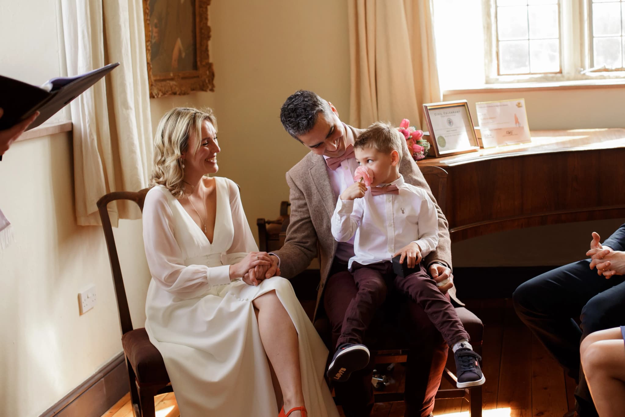
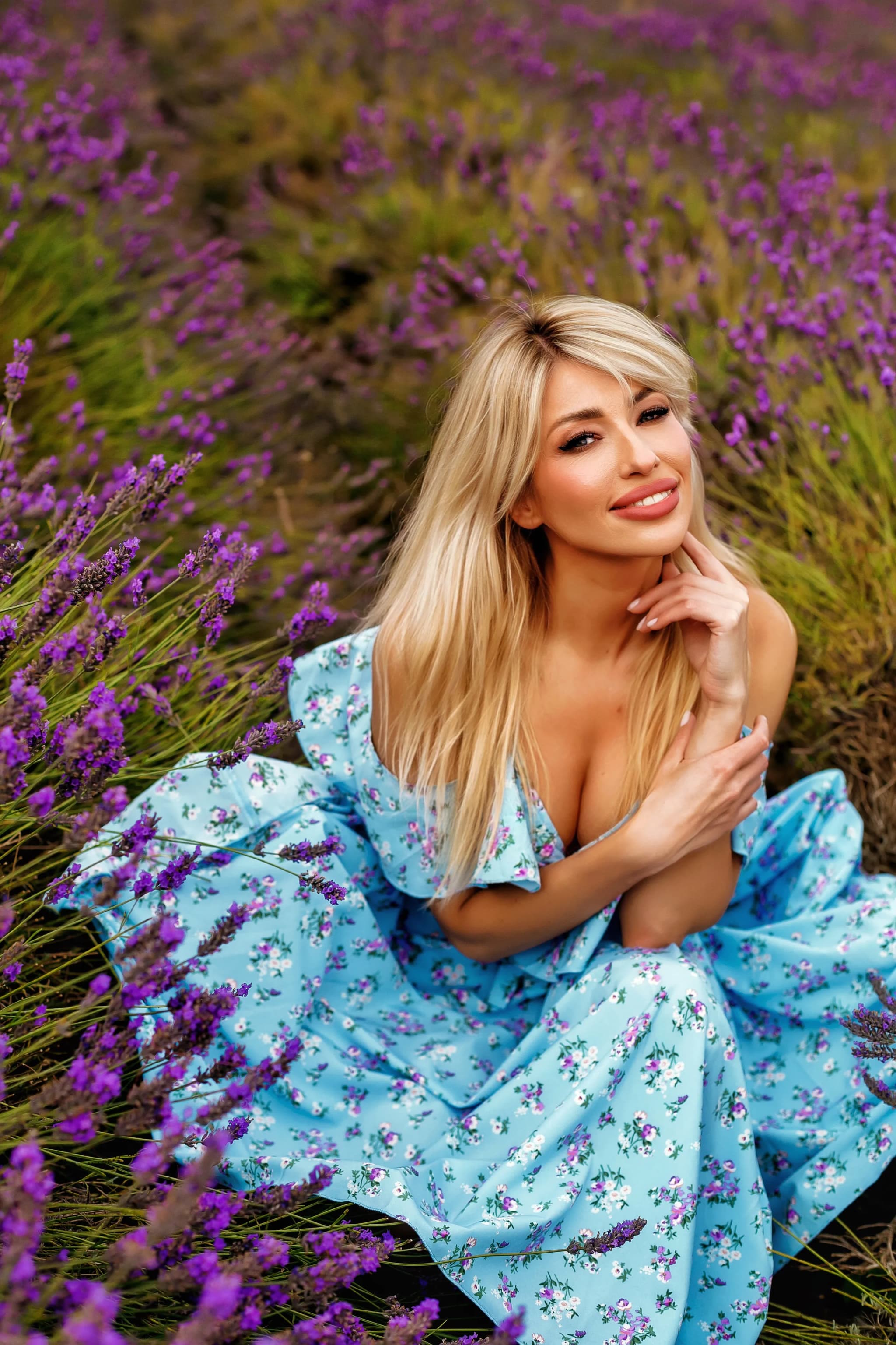
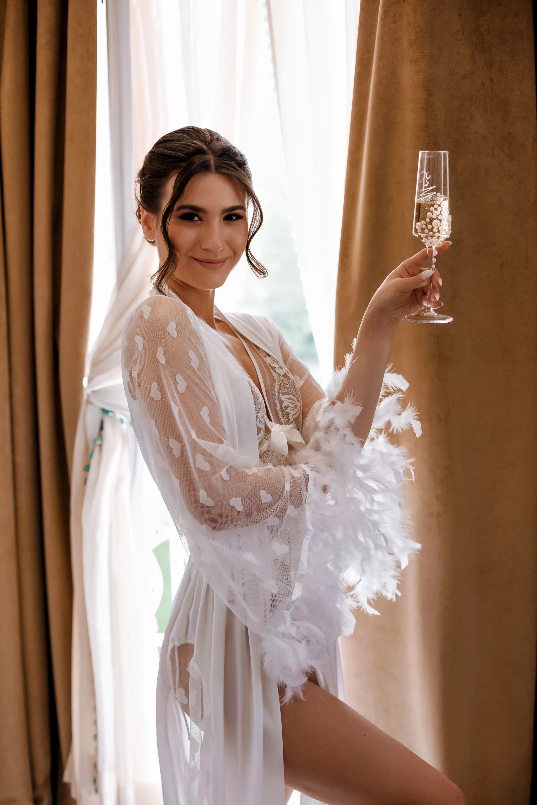
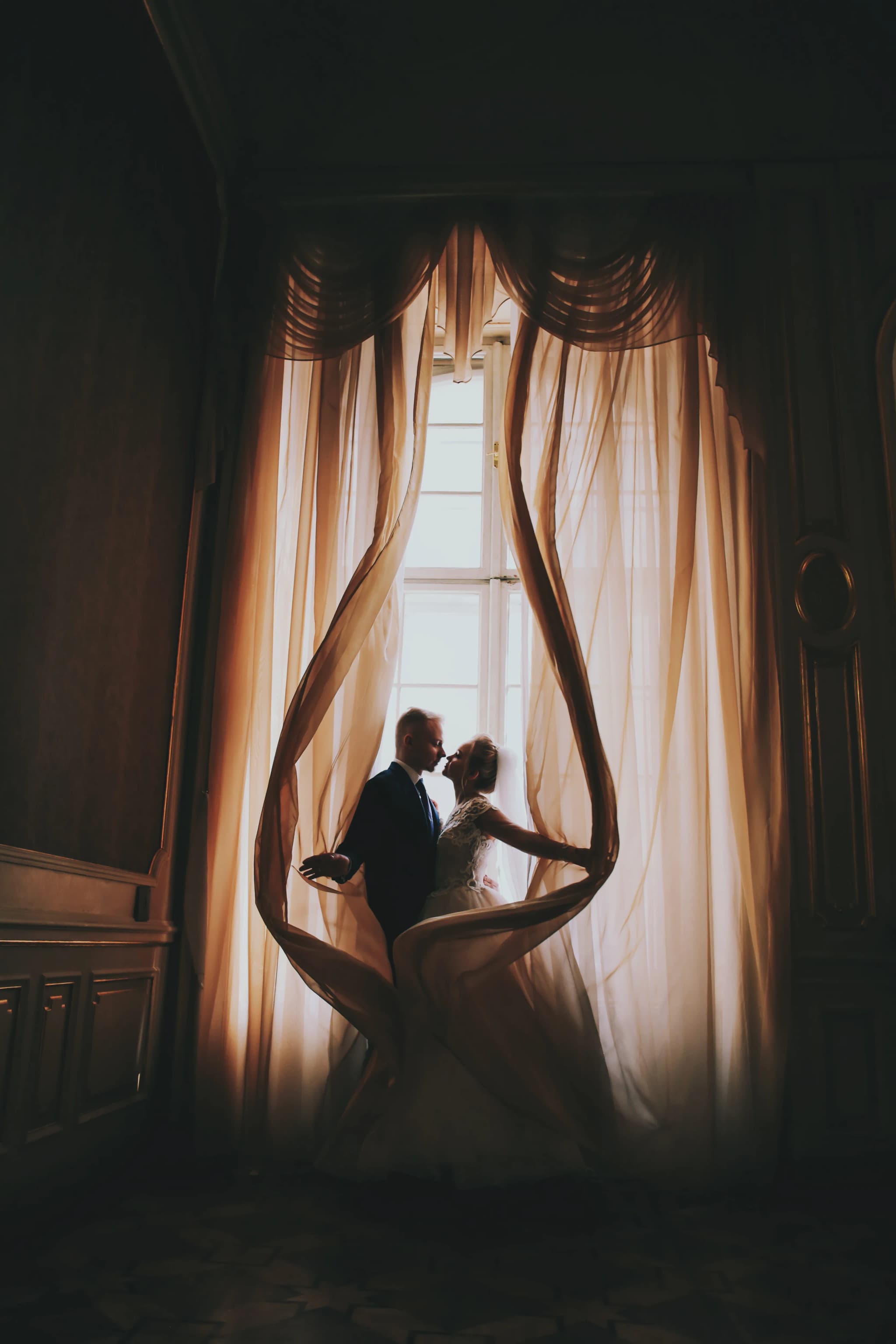
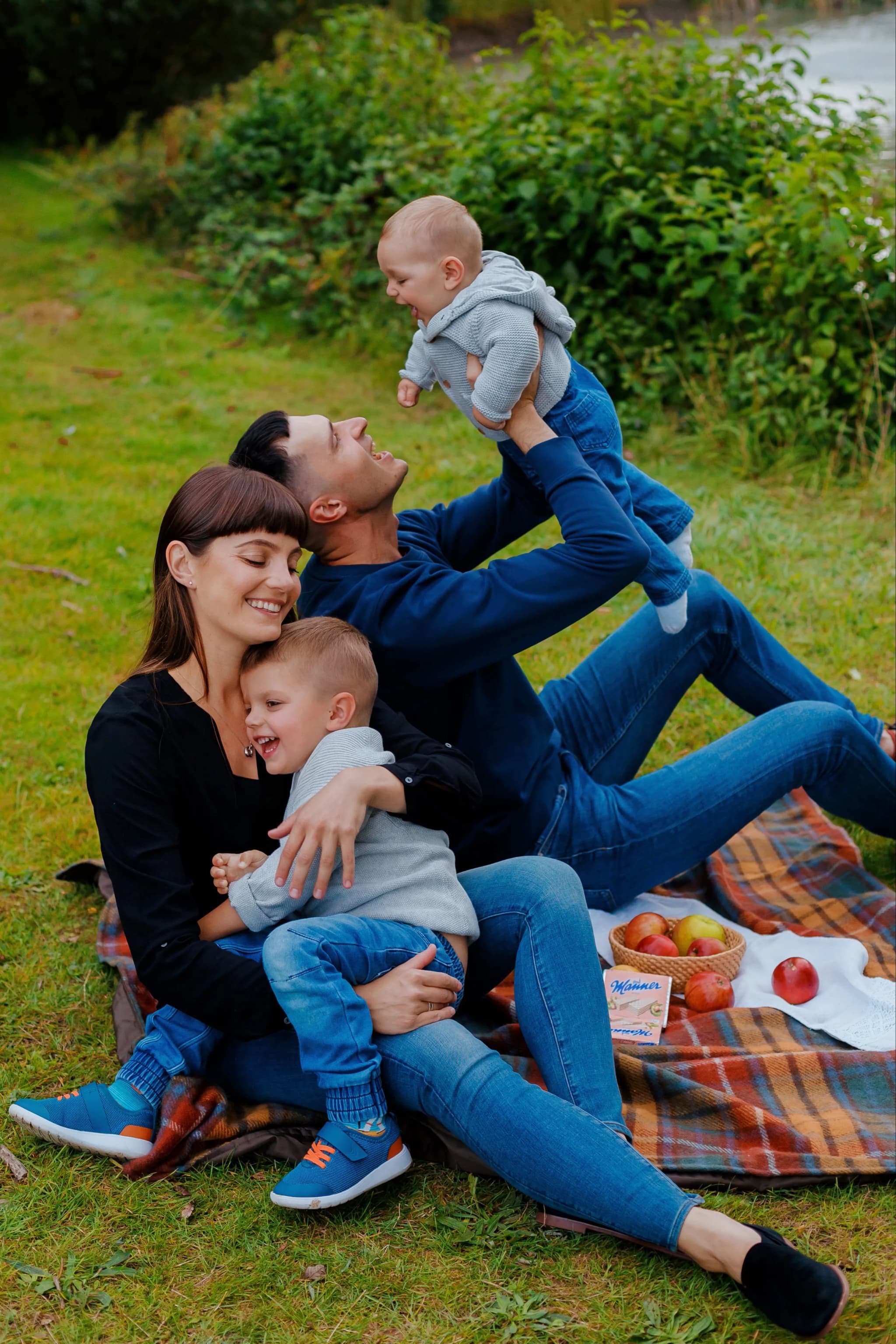
Beautifully Colour-Graded Photography
My distinctive colour grading style brings warmth, atmosphere, and timeless elegance to every gallery. Each set of images is carefully graded for consistency and emotional impact — creating photographs that feel as beautiful as the moments they capture. Let me bring that same attention to your story.