Extended family group portraits — grandparents, adult children, partners, and grandchildren together — are some of the most logistically complex and emotionally significant photography sessions in family portrait work. The challenge of coordinating clothing across multiple generations, body types, personal styles, and ages is significant, and the failure mode — mismatched, visually chaotic family groups — is common and avoidable. Getting the coordination right creates photographs of genuine warmth and visual beauty that become genuine family heirlooms.
The Core Challenge: Multi-Generation Coordination
Extended family photography typically involves three generations with genuinely different clothing preferences, body types, and levels of engagement with the coordination process. A framework that respects this reality:
- ◆ Anchor the palette, not the outfits: Choose a family colour palette of three to four coordinating tones, then allow each family member to wear their own clothing within that palette. No one needs to wear identical clothing — they need to wear colours that work together.
- ◆ Nominate one person as the palette coordinator: In practice, one family member (often whoever is organising the session) should take responsibility for confirming what each person plans to wear and flagging any conflicts. This is almost always necessary for groups of five or more people.
- ◆ Send guidance well in advance: Give family members the palette guidance at least two weeks before the session. This allows time for anyone to source an appropriate alternative if their initial plan conflicts with the coordination.
Building an Extended Family Palette
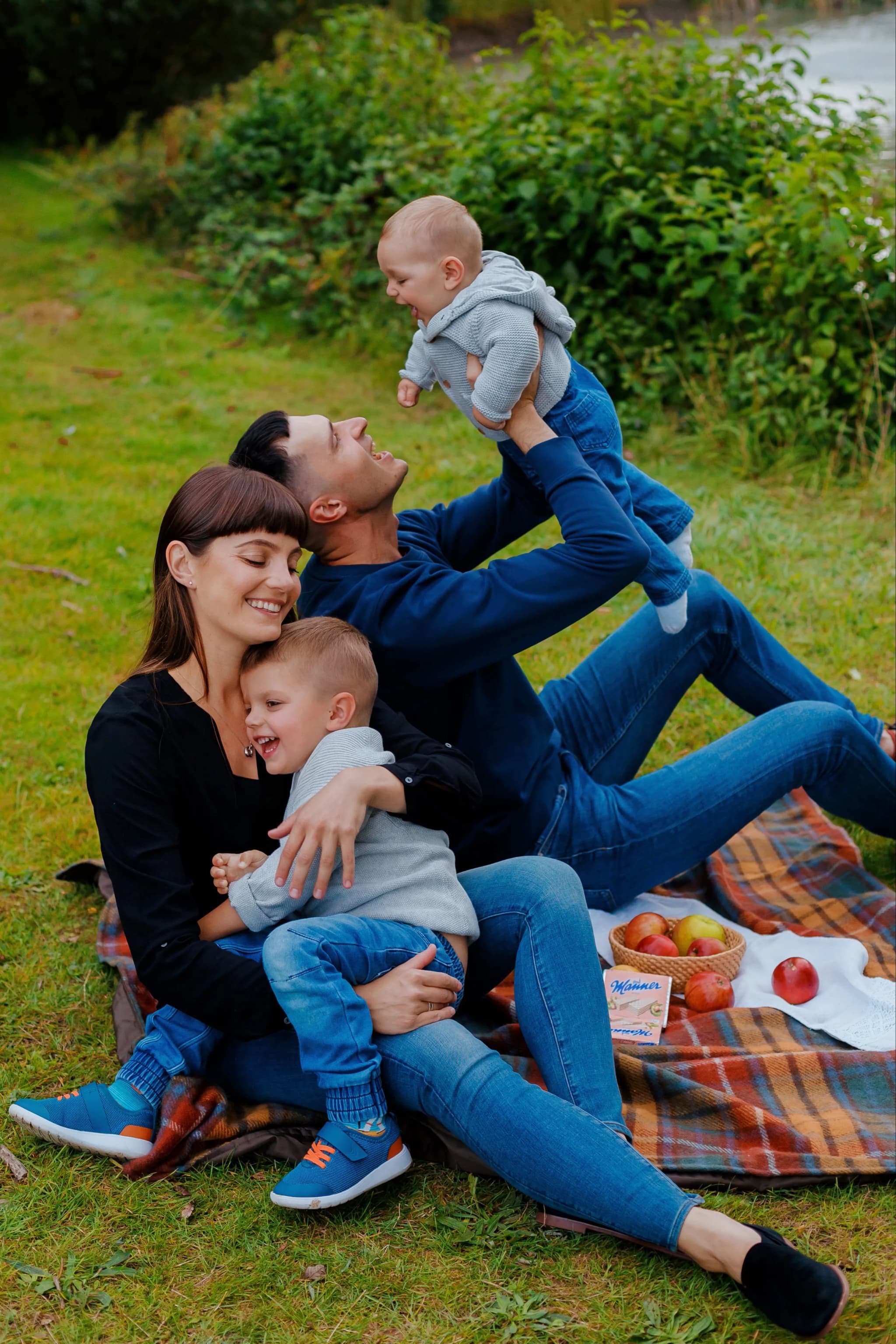
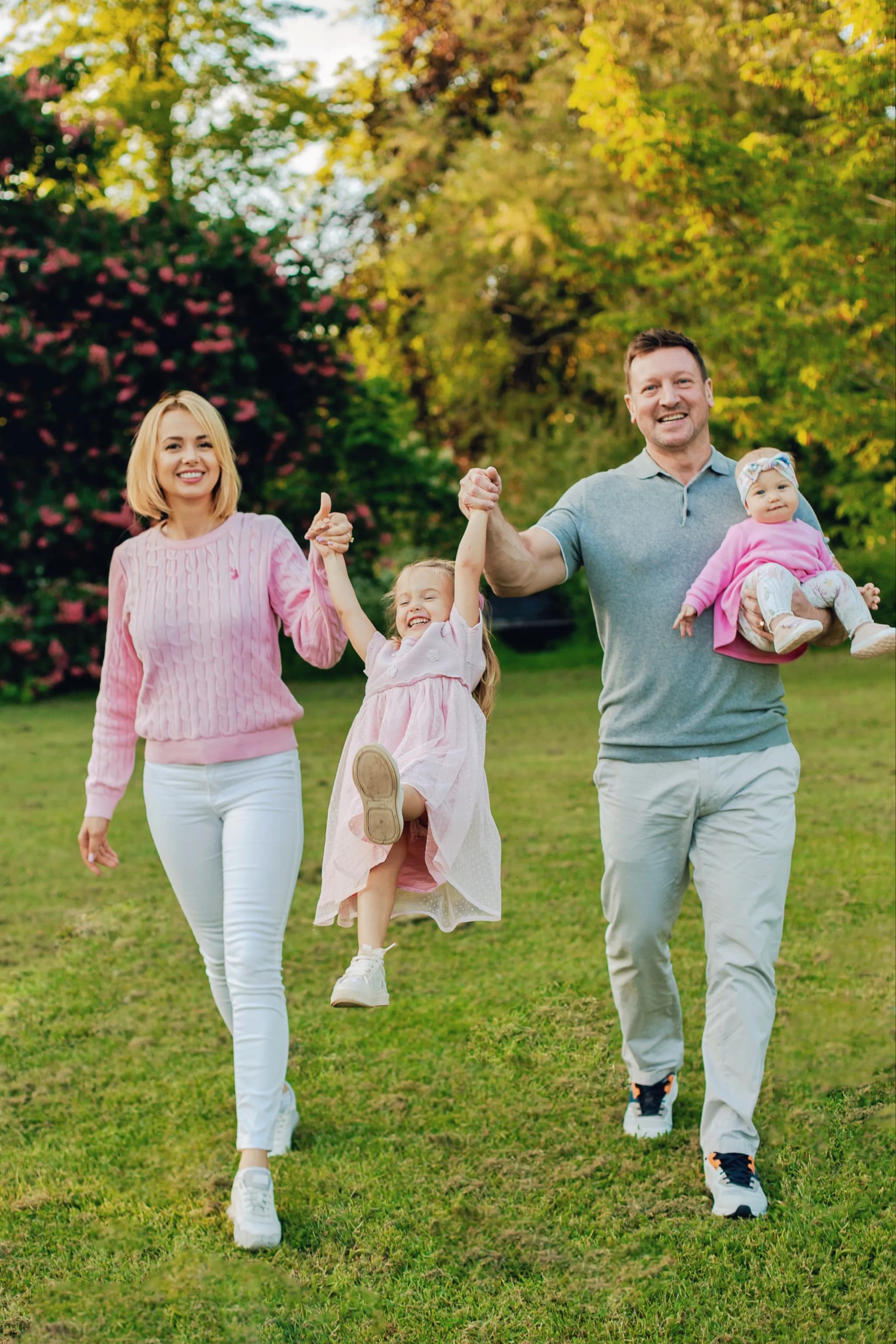
- ◆ A practical three-colour extended family palette: choose an anchor neutral (navy, charcoal, or warm camel), a supporting warm tone (dusty rose, warm burgundy, or sage green), and a light or accent tone (cream, warm white, or soft blush). Distribute these across the family group.
- ◆ Cream and warm white — essential inclusion in most extended family palettes. Beautiful on grandparents, children, and babies. Creates visual lightness and warmth within the group.
- ◆ Navy as anchor — the most reliable anchor colour for extended family photography. Works across all ages and body types, photographs with authority and warmth, and pairs well with virtually any warm or neutral secondary tone.
- ◆ Warm tone secondaries — dusty rose, camel, sage green, and warm burgundy all work as secondary colours within an extended family palette. Choose one or two and use them consistently across the group as complementary tones to the anchor.
- ◆ Avoid having more than four or five distinct colours in a large family group — beyond this, the visual coherence of the group is significantly reduced
Dressing for Different Ages in the Group
- ◆ Grandparents: Comfortable, quality clothing in the family palette. Avoid requiring formal attire that causes physical discomfort over a session. A quality knit, a quality shirt or blouse, and comfortable but coordinating footwear works well for grandparents across most session types.
- ◆ Adult children and partners: The generation most able to adapt their clothing to the palette guidance. Plain quality pieces in the assigned palette tones are ideal.
- ◆ Children and toddlers: Simple plain pieces in the family palette — avoid novelty prints, character clothing, and very bright colours that step outside the coordination. A plain tee or simple dress in one of the palette colours is ideal.
- ◆ Babies and very young children: Cream and warm white — beautiful in virtually any extended family palette and practical for the youngest family members. Simple soft rompers or plain dresses in cream or pale tones keep the visual focus on the tiny family member without disrupting the group coordination.
Formality Calibration
- ◆ The formality level of the session should be established clearly in advance and communicated to all family members — otherwise some will arrive in smart/formal clothing and others in casual weekend wear, creating visual dissonance that is impossible to resolve in editing
- ◆ Smart casual — quality plain clothing at a relaxed but clearly presented level — is the most widely accessible and broadly successful formality level for extended family portrait photography
- ◆ If grandparents are more comfortable in formal attire and younger family members prefer casual: compromise upward toward smart casual rather than downward toward casual. The photographs will serve the whole family better at a slightly higher formality level.
What to Avoid
- ✕ Allowing individual family members to interpret "coordinate" as "match completely" or "wear anything I like" — both extremes reduce the quality of the group photographs
- ✕ Very strong tonal contrast within the group — if some family members are in very dark clothing and others in very pale clothing, the group shots read as discordant
- ✕ Novelty, character, or heavily branded children's clothing in the group shots — these draw the eye immediately and disrupt the visual story of the family
- ✕ Leaving clothing coordination to the last minute — the later the guidance, the more likely it is that someone arrives in something that conflicts with the family palette
- ✕ Highly varied formality — suits and smart dresses alongside jeans and casual T-shirts creates immediate visual dissonance that cannot be resolved in the session
A Practical Approach to Group Coordination
- ◆ Share a brief written palette guide with specific colour names or a visual reference — phrases like "navy, cream, and dusty rose" are much more useful than "smart and coordinated"
- ◆ Ask each family member to confirm their planned outfit in advance to the coordinator — a quick message or photo of the planned outfit prevents surprises on the day
- ◆ Bring a simple backup option — a plain cream or navy item in a likely needed size can rescue an inadvertent coordination conflict on the day