Yana Skakun

What to Wear for a Spring Family Portrait Session
By Yana Skakun·1 June 2027·9 min read
Spring is one of the most beautiful and sought-after seasons for family portrait photography — blossom, soft light, fresh green, and the warmth of longer days create backdrops that make for exceptional family images. Spring sessions also present a specific clothing challenge: the season's variable light and its range of colours require clothing that complements the setting, photographs well in the soft natural tones of the season, and keeps everyone comfortable through a session that may move between sun and shade.
This guide covers colour coordination, fabric choices, and practical clothing strategies for spring family portrait sessions — whether in bluebell woodland, a park in full blossom, a Cambridge meadow, or a country garden.
📋 In this guide:
Spring Colour Palettes
Spring settings tend to be characterised by soft, fresh greens, creamy whites and blossoms, warm golden light in the morning, and the occasional burst of vivid colour from flowering trees and meadow blooms. The most effective family clothing palettes for spring work with these tones rather than competing with them.
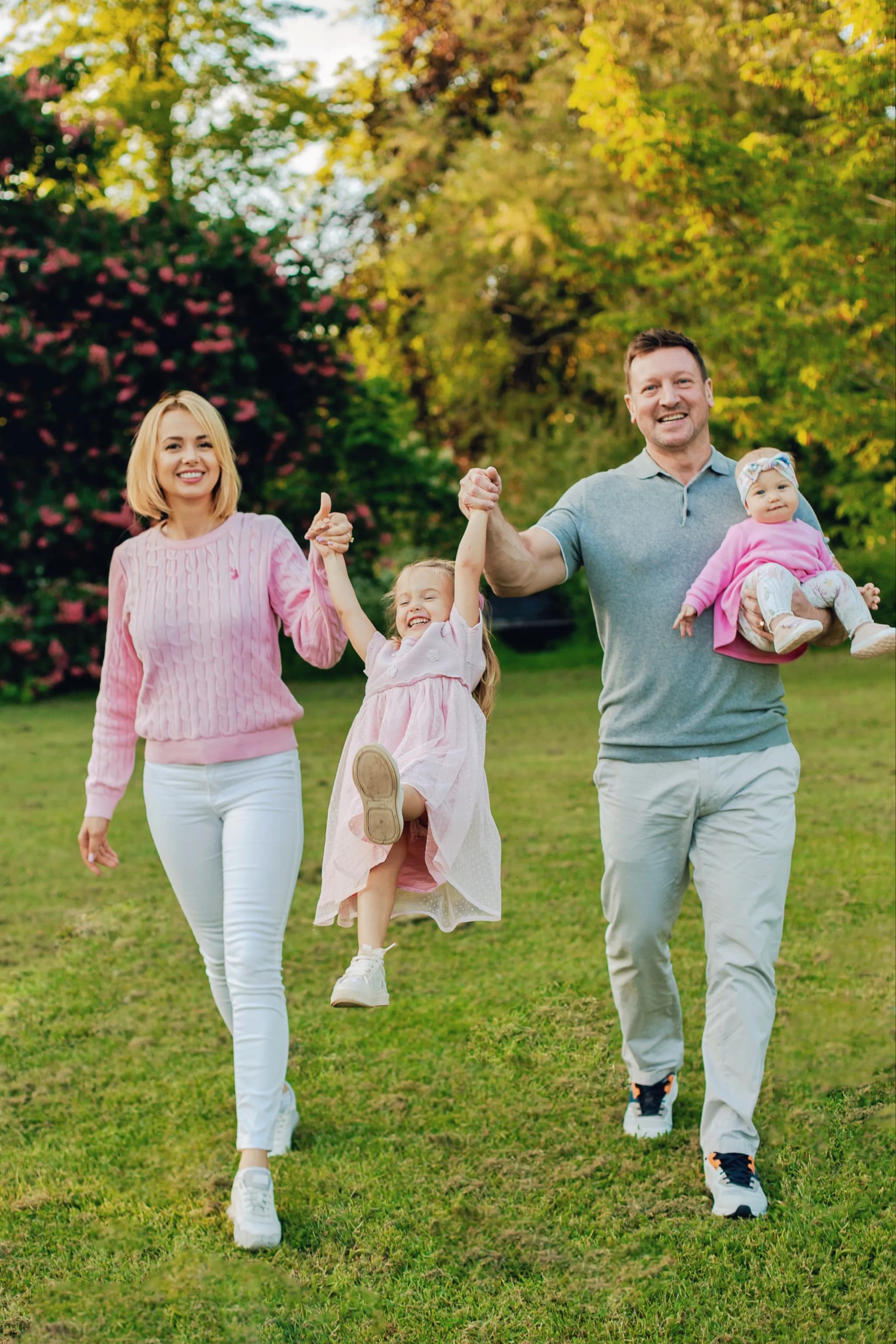
- ◆Warm neutrals — cream, warm white, soft stone: Warm neutrals photograph beautifully against spring green and blossom settings — the warmth of the tones complements the golden morning light frequently found in spring sessions without fading to washed-out in overcast conditions.
- ◆Soft dusty tones — dusty rose, dusty blue, sage, soft terracotta: Dusty, slightly desaturated versions of spring colours sit beautifully in the season — complementing blossom without competing with it, and creating a quietly coordinated family palette with genuine depth and character.
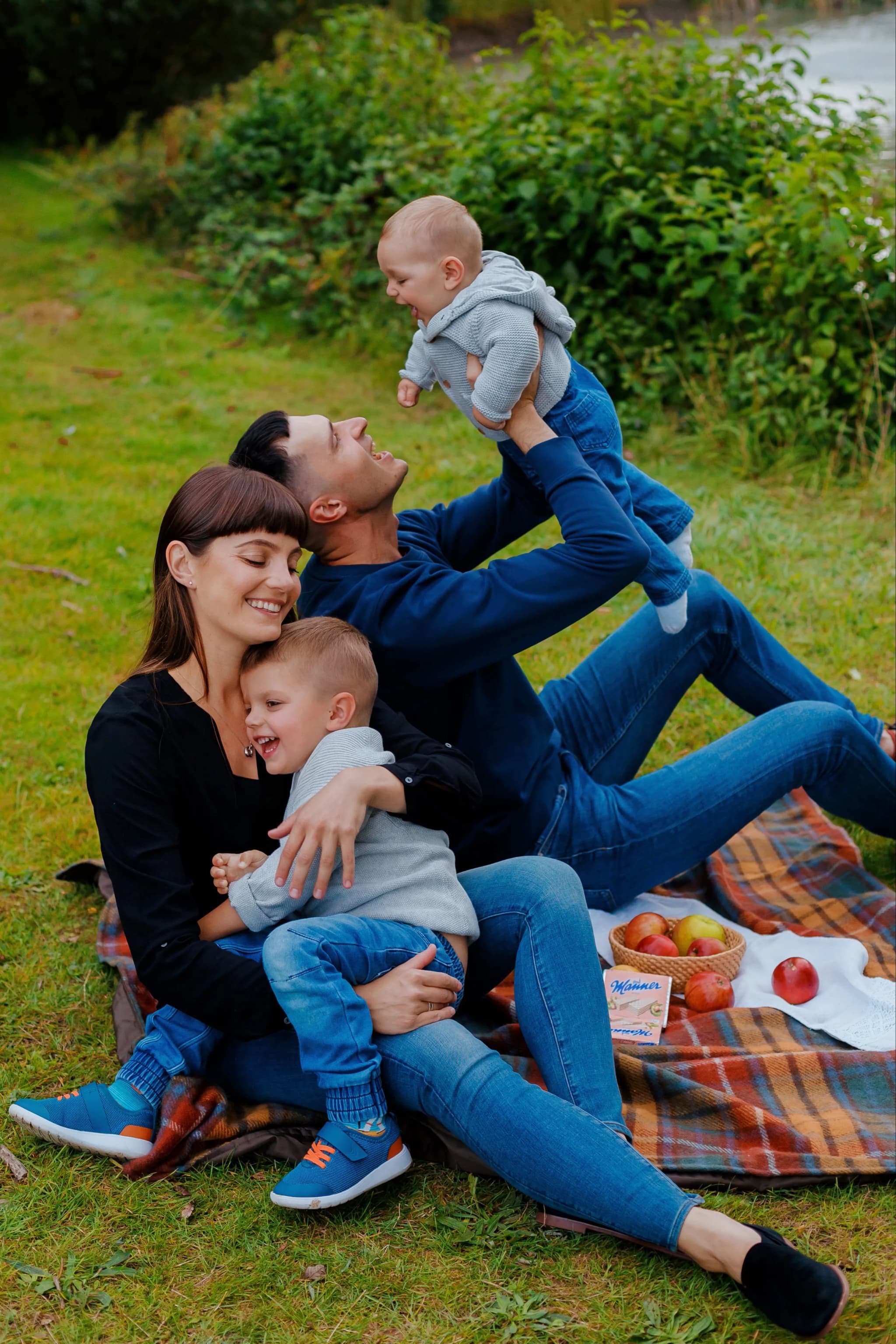
- ◆Warm richer tones — deep navy, warm burgundy, soft teal: Richer tones provide excellent grounding anchors in spring family palettes — one family member in a deeper navy or warm burgundy grounds the softer tones of the rest of the group and provides visual depth in the composition.
- ◆Avoid bright, saturated, or neon tones in spring settings: Highly saturated or neon tones compete with the soft light and delicate colour of spring settings and tend to dominate the image in ways that distract from the family. Spring sessions work best with considered, somewhat muted palettes.
Coordinating the Family
- ◆Coordinated palette, not matching outfits: Matching identical outfits across family members creates a dated, staged appearance that rarely serves modern family portraiture. A coordinated palette — three or four tones from the same colour family — creates visual unity while allowing individual character to be present.
- ◆One person leads, others respond: Begin with the person whose outfit is most considered or fixed — often an adult or the person with the fewest flexible options — and build the rest of the family's palette around that choice. This creates a coherent palette without feeling forced.
- ◆Children's clothing should allow movement and comfort: Children photographed in clothing that restricts movement, causes discomfort, or feels unfamiliar to them will show it in the images. Comfortable, well-fitting clothing that a child genuinely likes wearing produces more relaxed and authentic portraits.
- ◆Layer thoughtfully for variable spring conditions: Spring weather is variable — a light cardigan, denim jacket, or fine knit layered over a softer top gives options if the session is cooler than expected, and the layers can work photographically in their own right.
Fabric Choices for Spring
- ◆Natural fabrics in breathable, comfortable weights: Linen, cotton, and fine knit fabrics photograph beautifully in spring light — the texture of natural fabrics is visible and adds quality to the image. Breathable fabrics also keep everyone comfortable through a longer outdoor session.
- ◆Fine-texture fabrics that hold their shape well: Fabrics that hold their shape remain well-presented through the movement of a family session — linen blends, fine cotton jersey, and well-cut natural fabrics maintain their look well after the initial flat-lay phase.
- ◆Avoid very shiny or reflective fabrics outdoors: Shiny or reflective fabrics — satin, sequins, high-gloss technical fabrics — can pick up harsh reflections from spring sky and midday sun, creating uneven and distracting light in the portrait.
Setting-Specific Guidance
- ◆Bluebell woodland — soft neutral warmth: Bluebell sessions are among the most spectacular spring portrait opportunities. Clothing in warm neutrals, soft whites, and gentle cream tones photographs beautifully against the vivid blue-violet of bluebell carpets. Avoid purple or blue tones that will be absorbed into the setting.
- ◆Park and blossom — dusty soft tones: Park sessions with cherry, apple, or pear blossom as backdrop are best served by softer, dusty palettes — pale pinks, warm whites, sage, and soft stone tones that echo and complement the blossom without competing with it.
- ◆Meadow and wildflower — warm earthy and dusty tones: Spring meadow sessions benefit from warm earthy tones — soft terracotta, warm gold, sage, and navy — that sit naturally within a setting full of varied natural colour. Avoid very pale tones that may appear to merge with a busy background.
- ◆Country garden — warm and richly coordinated: Garden settings allow the strongest coordination choices — deeper, richer tones in a well-considered palette produce headshots with real visual depth. A warm burgundy, deep teal, or rich navy alongside warmer neutrals works exceptionally well.
Practical Tips
- ◆Book an early morning or late afternoon session for the best spring light: The soft, warm light of the hour after sunrise or the two hours before sunset transforms spring portrait photography. Avoid midday when overhead light flattens features and creates harsh shadows.
- ◆Have a spare set of clothing for younger children: Young children and toddlers have an extraordinary ability to find mud, grass stains, and food during family sessions. A spare top or complete change of clothing for the youngest family members avoids the session being disrupted by an unavoidable spill.
- ◆Check blossom timings before booking: Blossom windows are short — often as few as one to two weeks per tree. If your session is planned around a specific blossom setting, check with your photographer about the likely timing or build some calendar flexibility to respond to conditions.
What to Avoid
- ◆Matching identical outfits: As noted above, matching identical clothing across family members creates a staged, dated appearance that works against the natural, relaxed energy that the best spring family portraits capture.
- ◆Very pale or white clothing for younger children in outdoor sessions: White and very pale clothing shows marks very quickly during outdoor sessions, creating anxiety and distraction that affects the images. Soft cream or warm off-white tones work much better than pure white in outdoor spring sessions.
- ◆Colours that clash with or compete with the setting: Strong greens that blend into the spring foliage, bright yellows that compete with golden light, or blues that are absorbed into bluebell backgrounds all reduce the visual clarity of the portrait. The family should stand naturally apart from the setting.
- ◆Heavy winter fabrics and dark layering: Heavy winter clothing in spring sessions can look seasonally mismatched and may cause discomfort during the session. Light to mid-weight spring layers photograph more naturally and keep everyone comfortable through the session.
Spring family portrait sessions in Cambridgeshire
I photograph spring family portrait sessions across Cambridgeshire — in bluebell woodland, parks, meadows, and country gardens — creating images that capture the genuine warmth, connection, and joy of your family against the season at its most beautiful. To discuss your session, get in touch.


Yana Skakun
Photographer · England
Professional wedding, family and portrait photographer based in England. Passionate about capturing authentic emotions and timeless moments.
About Yana →spring family portrait session what to wearblossom family photography outfit guide UKbluebell woodland family session clothingspring outdoor family photographer Cambridgeshirecoordinated family outfits spring portraits
Family Tips — Family Photography in Cambridge & England
Yana Skakun offers natural, relaxed family photography sessions across Cambridge, Cambridgeshire, and the wider East of England. Sessions take place outdoors — in parks, woodland, and countryside — or at your family home, wherever everyone feels most at ease. This guide — What to Wear for a Spring Family Portrait Session — is part of the photography journal: practical, experience-based advice drawn from real sessions across England. Whether you arrived searching for spring family portrait session what to wear or blossom family photography outfit guide uk, the same care and attention shapes every session Yana photographs.
Family Photography sessions are available year-round, with bookings open across Cambridge, Ely, Huntingdon, Peterborough, and further afield — East England, London, the Midlands, and beyond. If you have specific questions about bluebell woodland family session clothing, mention it in your enquiry. Get in touch through the contact form above to check availability and discuss your session. Enquiries are welcomed from anywhere in the UK.
Continue Reading
Related Articles

Family Tips
Blended Family Photography: A Sensitive Guide to Step-Families, Co-Parenting & Group Portraits
11 min read · Read Article
Family Tips
Baby Milestone Photography: Capturing Every Stage of the First Year
10 min read · Read Article
Family Tips
Maternity Photography in England: When to Book, What to Wear & Where to Shoot
11 min read · Read Article
Get in Touch
Ready to Book Your Session?
Get in touch to discuss your vision — I'll reply within 24 hours.