Yana Skakun
Colour schemes for your family photoshoot: What works & what doesn't
By Yana Skakun·25 July 2026·6 min read
One of the questions I'm asked most frequently before a family session is: “What should we wear?” Choosing outfits that work well together — and work with your chosen location — makes a significant difference to how your photographs look. But it doesn't need to be complicated.
The key principle: you don't need to match. You need to coordinate. Matching outfits (everyone in the same colour) can look staged; coordinating outfits that work harmoniously together look natural and intentional.
The Foundation Rule: Choose a Palette, Not a Colour
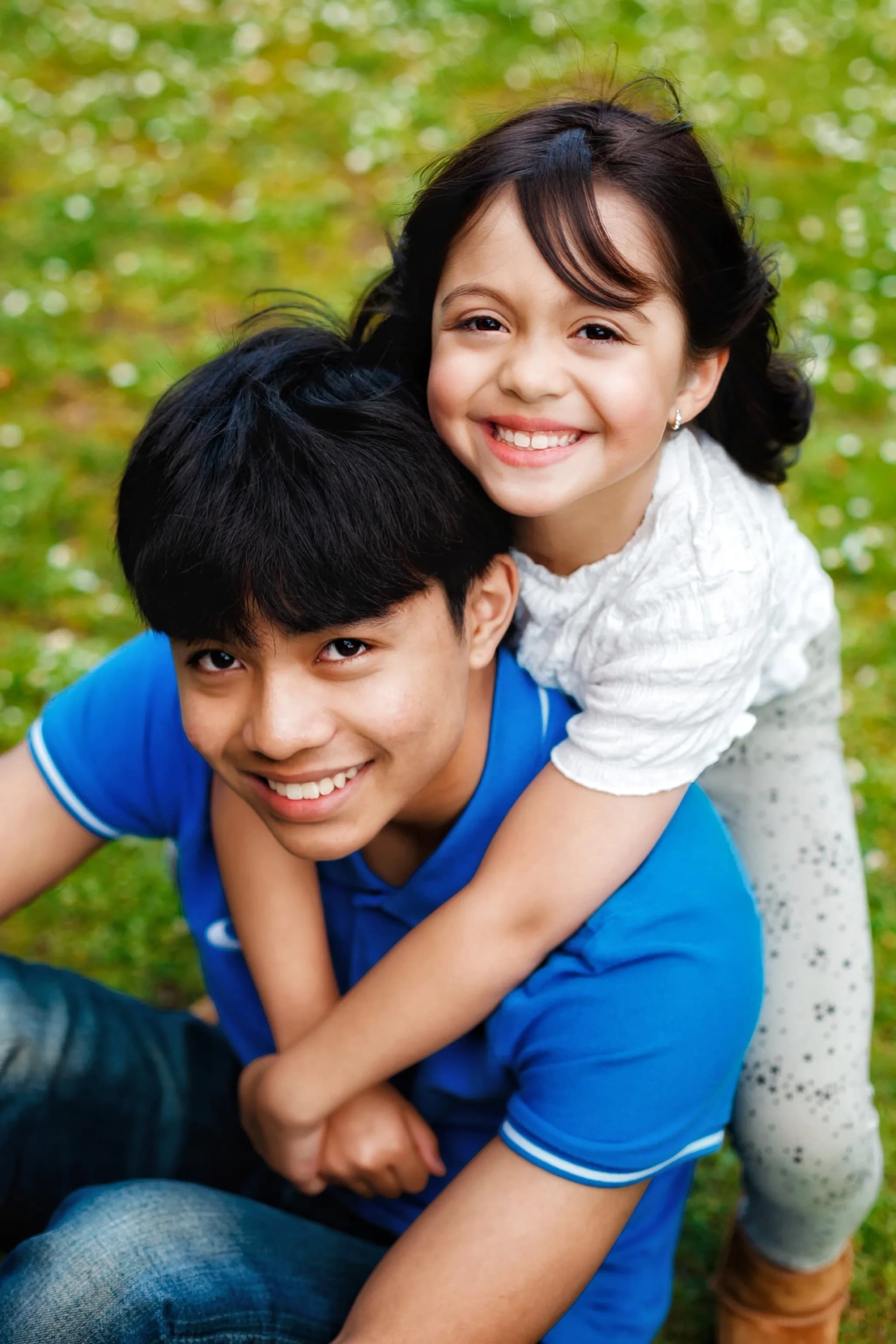
Pick 2–3 base colours that work together, then let each family member wear something within that palette. Some can be the same colour (e.g. two children in cream), others can be an accent (e.g. a parent in a dusty rose). This creates harmony without uniformity.
Example palette for a family of four: Mum in dusty rose, Dad in warm beige, older child in cream, younger child in sage green. All warm tones, all soft — they'll sit beautifully together in photographs without looking like a school uniform.
Seasonal Colour Palettes
Autumn
Best: Camel, rust, cream, denim, forest green
Avoid: Black, neon, grey
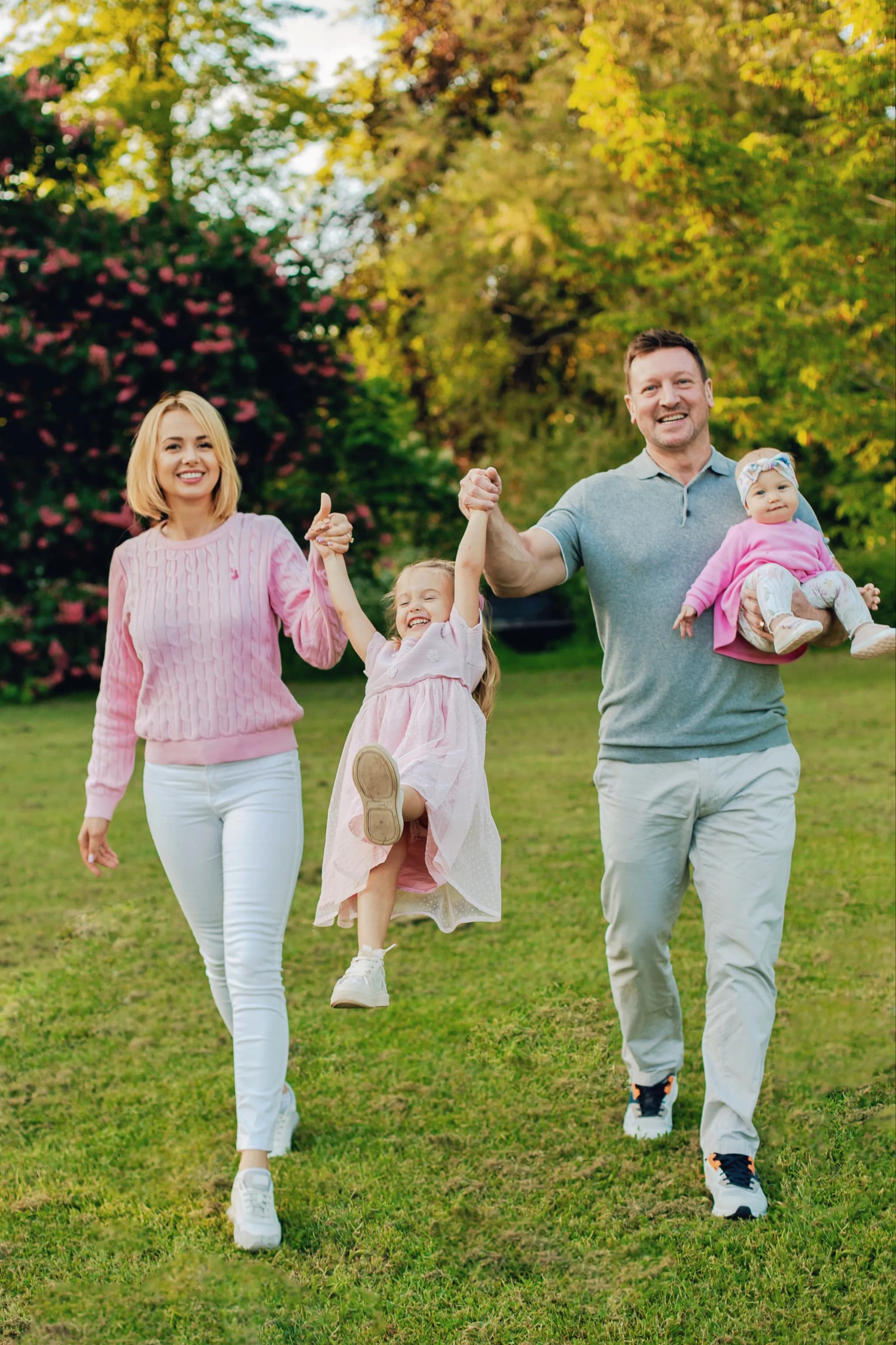
Spring / Bluebells
Best: Cream, dusty pink, sage, pale blue, terracotta
Avoid: Bright red, stark white, neon
Summer / Golden Hour
Best: Dusty rose, warm white, olive, cornflower blue
Avoid: Black, heavy navy
Winter / Evergreen
Best: Burgundy, forest green, cream, warm red, dark navy
Avoid: Pale pastels, bright yellow
Common Mistakes to Avoid
✗ Everyone in white
White reflects too much light and can create exposure problems. One person in white can be beautiful — the whole family often looks clinical.
✗ One person in very dark colours
If five family members are in soft neutrals and one person is in stark navy or black, they"ll look visually isolated in every photo. Adjust the darkest outfit to a dark olive or deep teal instead.
✗ Logos and busy patterns
Branded clothing and large patterns are distracting in photographs. Solid colours or very subtle patterns (fine stripes, small checks) work much better.
✗ Mismatching skin tones
Very cool colours (stark grey, cold blue, bright white) can make UK skin tones look washed out. Warm or neutral tones are universally more flattering.
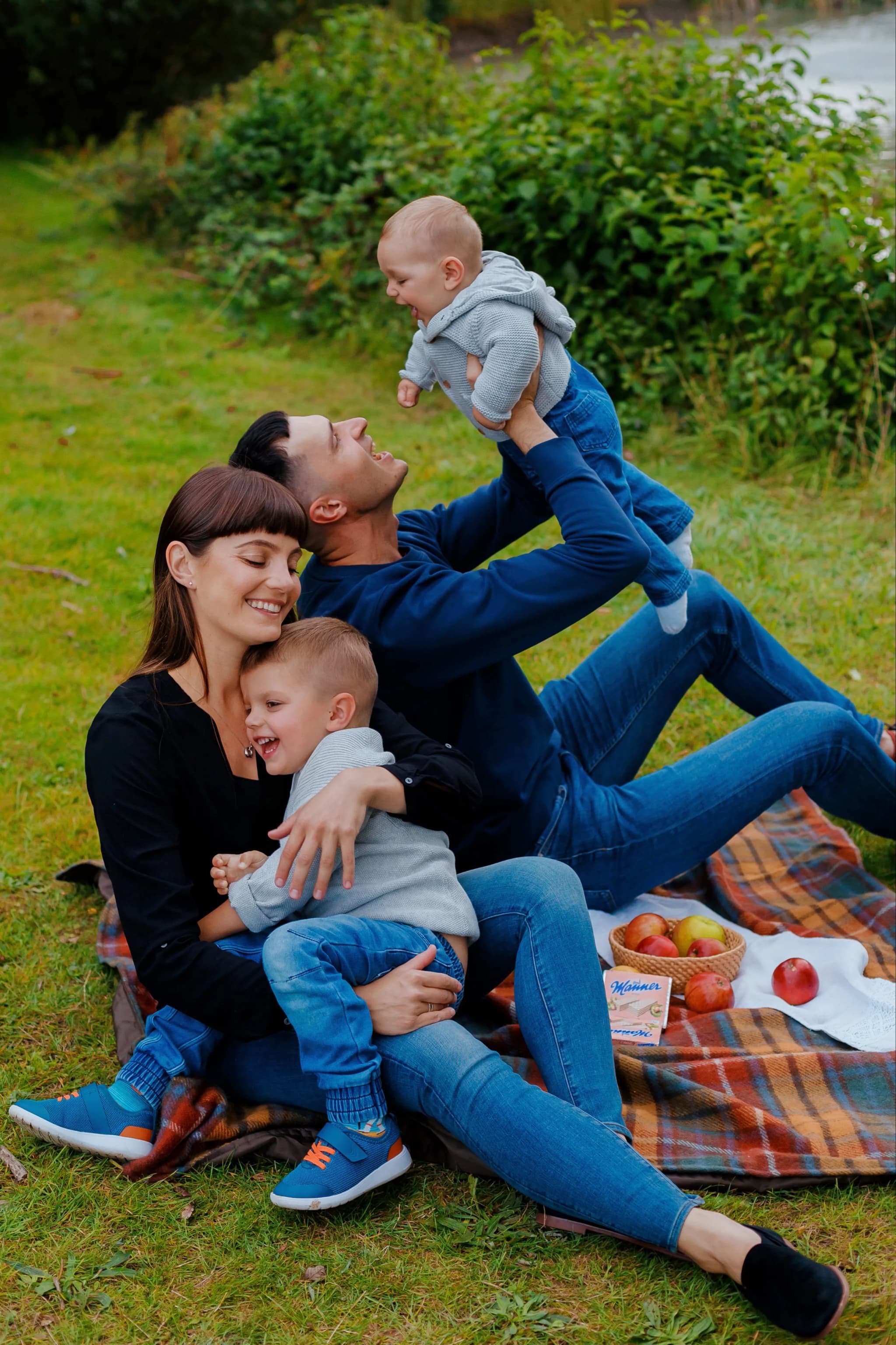
Practical Styling Tips
- Start with the person who is hardest to dress (usually a toddler — limited choices) and build the palette around them
- Layers are great — scarves, cardigans, gilets add visual interest without competing with faces
- Avoid clothing you'd never normally wear — if Mum is always in jeans, a formal dress will look and feel wrong
- Iron and check outfits the day before — creased clothes are distracting in photos
- For outdoor sessions: practical, comfortable footwear (wellies, trainers) is absolutely fine
- Bring a spare outfit for toddlers — mandatory
Not Sure What to Wear?
When you book a family session with me, I send a detailed preparation guide including specific colour palette recommendations for your chosen location and season. You're never left guessing.
Book a Family Session →


Yana Skakun
Photographer · England
Professional wedding, family and portrait photographer based in England. Passionate about capturing authentic emotions and timeless moments.
About Yana →family photoshoot colour schemeswhat to wear family photos UKcoordinating outfits family sessionfamily photo outfit ideas Englandcolour palette family photography
Family Tips — Family Photography in Cambridge & England
Yana Skakun offers natural, relaxed family photography sessions across Cambridge, Cambridgeshire, and the wider East of England. Sessions take place outdoors — in parks, woodland, and countryside — or at your family home, wherever everyone feels most at ease. This guide — Colour schemes for your family photoshoot: What works & what doesn't — is part of the photography journal: practical, experience-based advice drawn from real sessions across England. Whether you arrived searching for family photoshoot colour schemes or what to wear family photos uk, the same care and attention shapes every session Yana photographs.
Family Photography sessions are available year-round, with bookings open across Cambridge, Ely, Huntingdon, Peterborough, and further afield — East England, London, the Midlands, and beyond. If you have specific questions about coordinating outfits family session, mention it in your enquiry. Get in touch through the contact form above to check availability and discuss your session. Enquiries are welcomed from anywhere in the UK.
Continue Reading
Related Articles

Family Tips
Blended Family Photography: A Sensitive Guide to Step-Families, Co-Parenting & Group Portraits
11 min read · Read Article
Family Tips
Baby Milestone Photography: Capturing Every Stage of the First Year
10 min read · Read Article
Family Tips
Maternity Photography in England: When to Book, What to Wear & Where to Shoot
11 min read · Read Article
Get in Touch
Ready to Book Your Session?
Get in touch to discuss your vision — I'll reply within 24 hours.