Yana Skakun
Best Wedding Colours 2027: Trending Palettes for Photos
By Yana Skakun·2 October 2026·6 min read
The colours a couple chooses for their wedding affect the resulting photographs far more than most people anticipate during planning. Some palettes that look beautiful in person are genuinely difficult to balance on camera, while others that feel quiet or understated in the room produce images that stay timeless for decades. Going into 2027, the trending wedding palettes I am seeing also happen to be among the most photographically forgiving I have worked with in years.
The Palettes Defining 2027
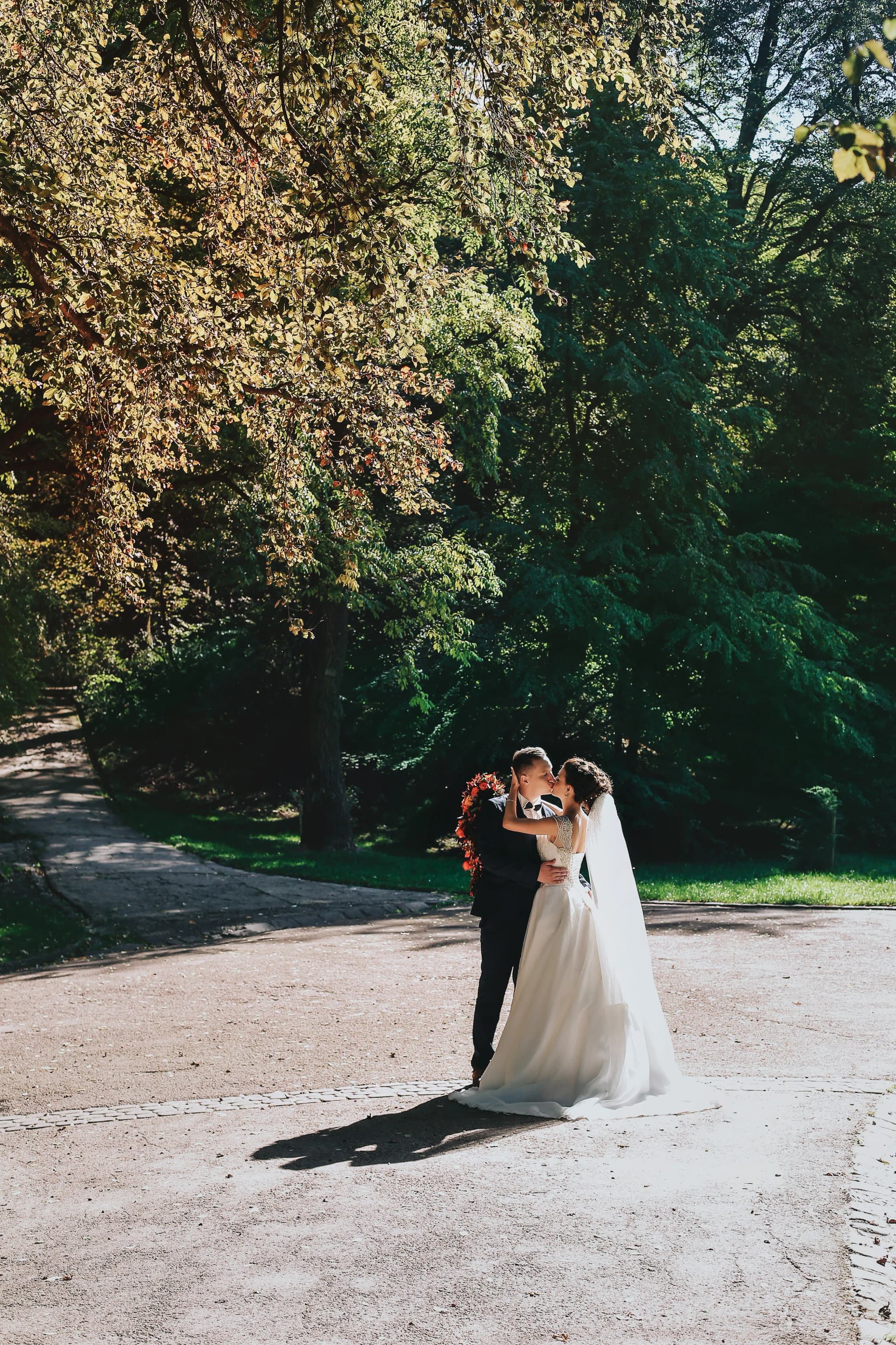
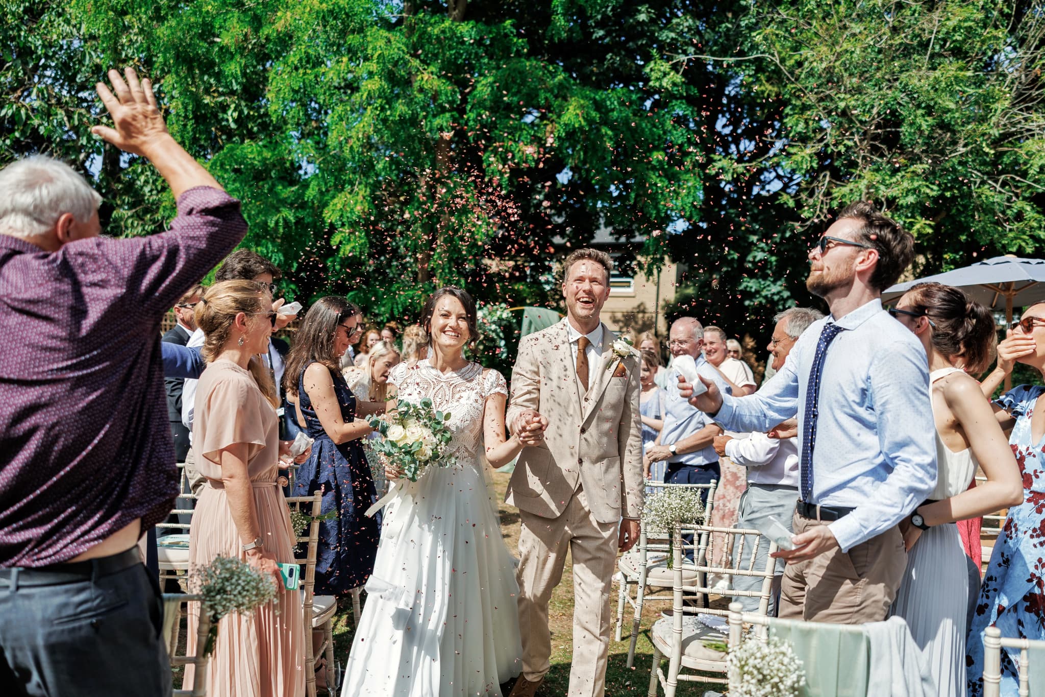
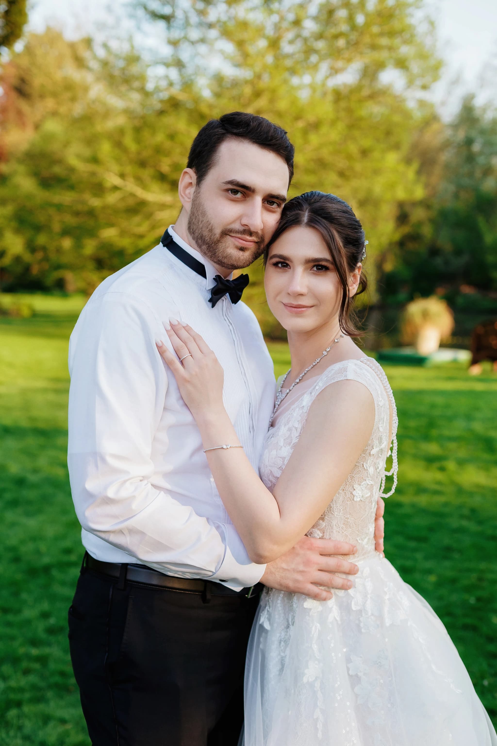
Warm ivory and soft white has become the dominant neutral this year — warm rather than stark. Ivory, cream, and warm white all photograph beautifully in English light, whereas a stark brilliant white tends to blow out and lose detail in bright outdoor conditions. Sage and dusty green, a trend that peaked a few years ago, has settled into a genuinely dependable choice that sits well against most English landscapes and photographs cleanly even in flat, overcast light.
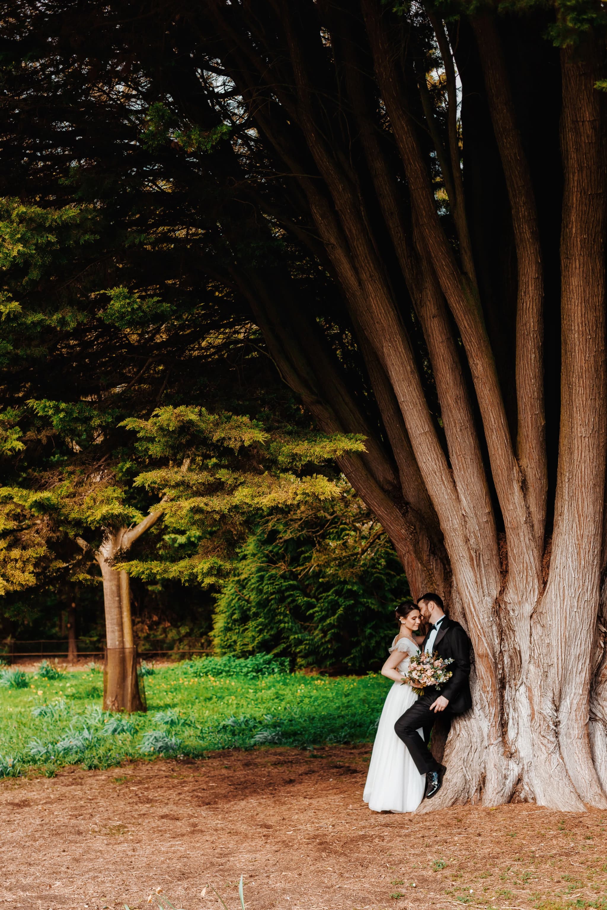
Terracotta and rust are showing up frequently too, particularly for autumn weddings and venues with stone interiors, and both tones flatter a wide range of skin tones on camera. Dusty rose and muted blush — soft, de-saturated pinks rather than bright coral or fuchsia — age far better in photographs than the saturated bridal pink that dates so quickly in older wedding albums. Warm caramel and gold, used as metallic accents alongside caramel florals, work particularly well with the golden-hour light that still dominates bridal portraiture, and a more unusual palette of French grey and soft lavender is appearing for spring and early summer weddings, though it needs careful attention in editing to avoid a slightly cool, washed-out skin tone.
Why Colour Choice Actually Matters to a Photographer
Highly saturated colours — primary reds, electric blue, neon shades — are genuinely harder to balance in post-production and tend to fight visually with skin tones rather than complementing them. Muted, warm palettes give far more room to work with in the edit, and produce a more cohesive final gallery as a result.
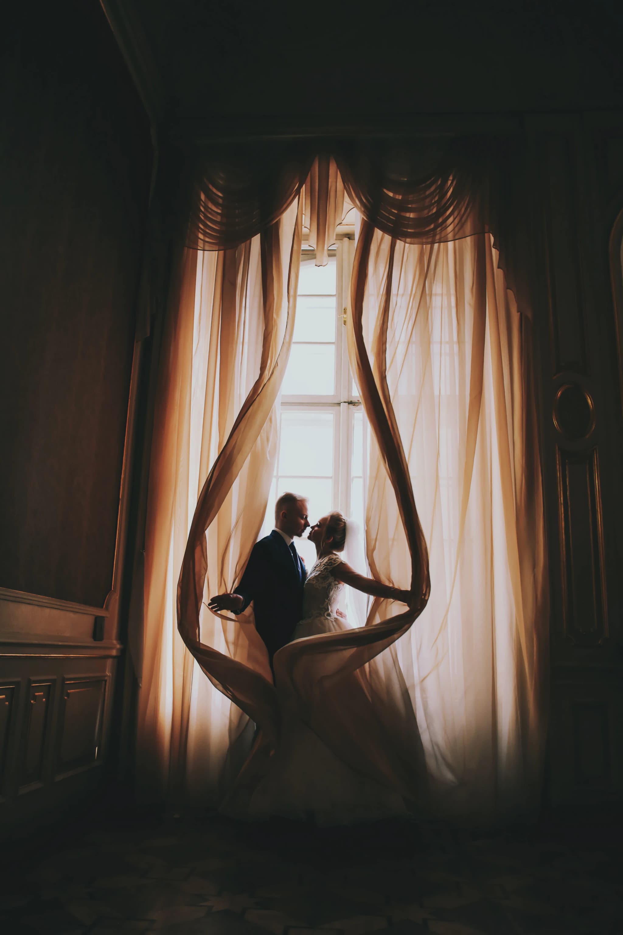
Colour also reflects onto skin in ways that are easy to underestimate before the day — a tightly enclosed space with strongly coloured walls can cast an unflattering tone across faces, particularly cool-toned rooms, which can leave skin looking slightly grey in photographs. Warm-toned rooms, by contrast, tend to flatter naturally. It is also worth remembering that florals catch and reflect light quite differently from fabric or painted walls, so the same colour named on a mood board can read very differently depending on whether it appears in a bouquet or on a bridesmaid's dress.
Planning your palette with photography in mind
If you are still choosing colours for your day, I am happy to talk through how a palette will actually read in photographs before you commit to florals, stationery, or bridesmaid dresses.
Talk through your wedding coloursCoordinating Colour Across Florals, Stationery and Attire
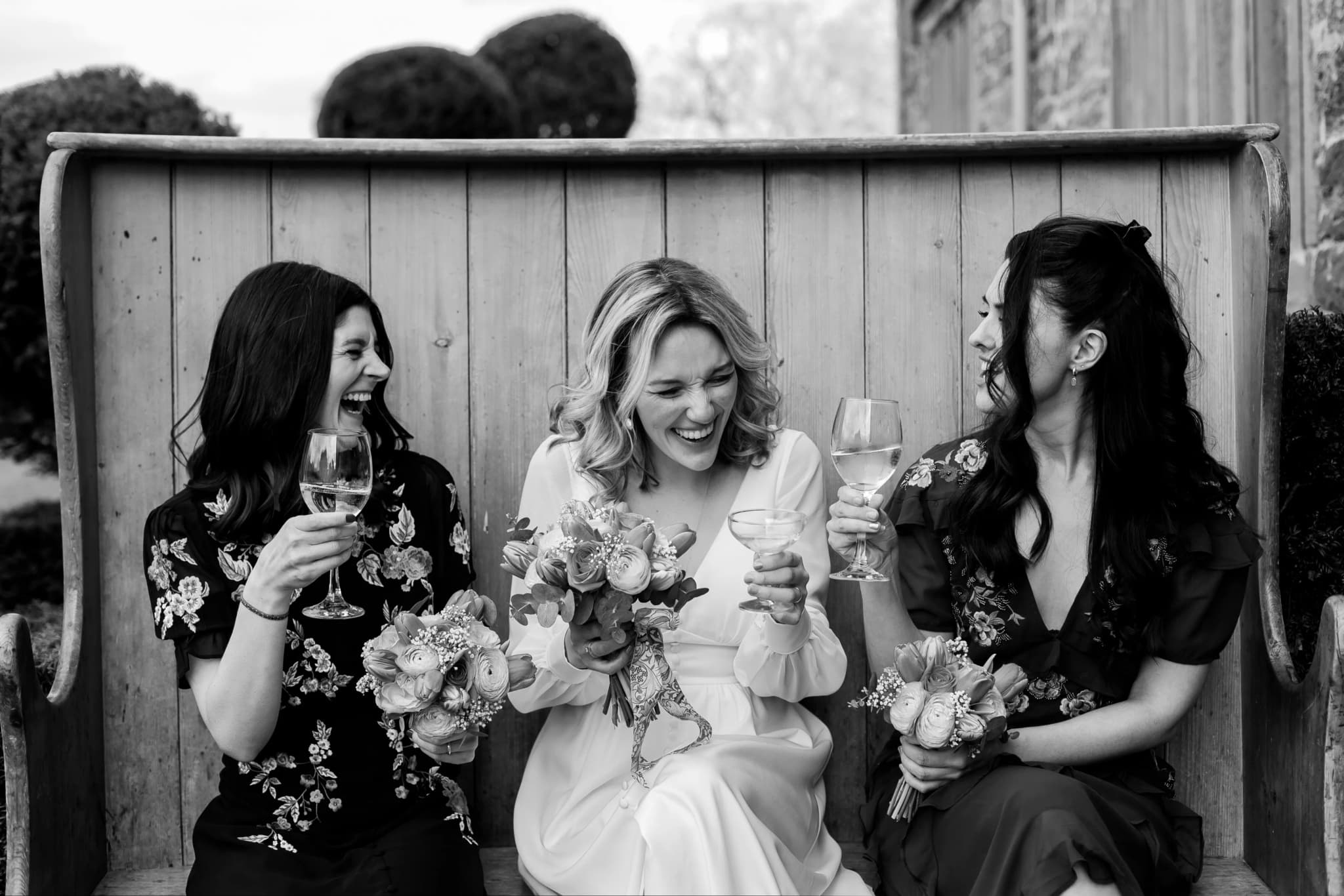
One detail couples often overlook is that a colour scheme needs to be considered across several different materials at once, not just picked from a single swatch. A dusty rose that looks perfect on a fabric swatch can photograph quite differently once it appears in silk, in a printed invitation, and in a fresh flower — each surface reflects and absorbs light slightly differently, and the same named colour can genuinely look like three different shades once the day arrives.
I generally recommend testing a proposed palette against real fabric and floral samples in natural daylight before committing, rather than relying on digital mood boards or paint swatches alone, since screen colours in particular rarely translate accurately to how a colour behaves in outdoor English light on the day itself.
Colours Worth Approaching Carefully
Bright white remains technically challenging in outdoor English sun and often needs careful exposure management to avoid losing detail in a dress. Neon and electric tones look vibrant in person but are genuinely difficult to balance against skin tones once a camera is involved, and lilac or bright purple has a tendency to desaturate or shift towards blue under mixed indoor lighting, which can leave a carefully chosen colour scheme looking quite different in the final gallery than it did in the room.
Bright red sits in a similar category — beautiful in person, but it absorbs and reflects light differently from most other colours and needs careful balancing against skin tones to avoid an unnatural cast in nearby portraits. None of this means these colours should be avoided altogether, only that they benefit from a conversation about lighting and timing before the day itself.
Why the Muted 2027 Trend Is Good News for Longevity
Saturated trend colours tend to date a set of wedding photographs quite visibly within a decade — think back to the fuchsia and turquoise combinations popular in past decades, which now read as unmistakably of their era. The warm, muted palettes trending through 2027 are, if anything, a genuinely positive development for the longevity of your photographs. Images shot within this kind of palette are likely to still look current and elegant in fifteen years, rather than immediately placing the wedding to a specific year.
If you are drawn to a genuinely bold or unusual colour that falls outside the current trend, that is not a reason to abandon it — some of the most memorable weddings I have photographed used colour choices well outside the mainstream. It simply means having an honest conversation in advance about lighting, venue, and timing, so the colour reads on camera the way you actually picture it in your head.
A Practical Way to Test Your Palette Before Committing
Before finalising florals or bridesmaid dresses, it is worth holding a small swatch or bloom in the same kind of light your ceremony or reception will actually take place in — outdoor daylight for a garden ceremony, warm indoor lighting for an evening reception — and taking a simple photograph on an ordinary phone camera. This will not replicate professional lighting exactly, but it gives a genuinely useful early indication of whether a colour reads as intended or shifts unexpectedly once it is out of the shop or the mood board.
If anything looks off in that quick test, it is far easier and cheaper to adjust a colour choice months ahead of the wedding than to discover the mismatch for the first time in the finished gallery.
Choosing a Palette Around Your Venue, Not Just the Calendar Year
Trend forecasts are a useful starting point, but the single biggest factor in whether a palette photographs well is still the venue itself. A warm caramel and gold scheme suits a stone barn or a country house interior beautifully, while the same palette can feel slightly heavy against the crisp, pale stonework of a Cambridge college chapel, where a lighter ivory or sage scheme often reads more naturally in photographs.
My general advice is to let the 2027 trends inform your options rather than dictate your final choice, and to weigh them against the specific light and material palette of your actual venue before committing to anything.

Yana Skakun
Photographer · England
Professional wedding, family and portrait photographer based in England. Passionate about capturing authentic emotions and timeless moments.
About Yana →wedding colours 2027trending wedding palettes 2027best wedding colours photos 20272027 wedding colour trends uk
Wedding Tips — Wedding Photography in Cambridge & England
Yana Skakun is a professional wedding photographer based in Cambridge, covering weddings across England — from intimate elopements to full-day ceremonies at country houses, barns, and city venues. Every couple receives a relaxed, documentary approach that captures the day as it truly unfolds. This guide — Best Wedding Colours 2027: Trending Palettes for Photos — is part of the photography journal: practical, experience-based advice drawn from real sessions across England. Whether you arrived searching for wedding colours 2027 or trending wedding palettes 2027, the same care and attention shapes every session Yana photographs.
Wedding Photography sessions are available year-round, with bookings open across Cambridge, Ely, Huntingdon, Peterborough, and further afield — East England, London, the Midlands, and beyond. If you have specific questions about best wedding colours photos 2027, mention it in your enquiry. Get in touch through the contact form above to check availability and discuss your session. Enquiries are welcomed from anywhere in the UK.
Frequently Asked Questions
How much does a wedding photographer cost in England?+
Wedding photography in England typically ranges from £1,500 to £4,000+ for a full day. Price depends on experience, coverage hours, and whether albums or engagement shoots are included. Most photographers charge between £2,000–£3,000 for 8–10 hours of coverage.
How early should you book a wedding photographer?+
For peak season (May–September), book 12–18 months in advance. For autumn and winter weddings, 9–12 months is usually sufficient. Popular photographers at popular venues fill up fast — as soon as you have a date and venue confirmed, start reaching out.
How many photos do you get from a wedding photographer?+
Most professional wedding photographers deliver 400–800 edited images for a full-day wedding. The exact number depends on coverage hours, how many guests there are, and the photographer's editing style. Quality matters more than quantity — a curated gallery of 500 images tells the story better than 1,500 unedited files.
Do you need a second photographer at your wedding?+
A second photographer is helpful if you want simultaneous coverage of getting-ready moments in different locations, multiple angles during the ceremony, or more candid coverage during the reception. It adds cost but significantly increases the variety and completeness of your gallery.
What is the difference between documentary and editorial wedding photography?+
Documentary (reportage) wedding photography captures moments as they happen — the photographer observes and doesn't intervene. Editorial photography involves deliberate direction: placing you in good light, shaping compositions, creating intentional portraits. Most photographers blend both styles throughout the day.
Continue Reading
Related Articles

Wedding Tips
Sustainable Eco-Friendly Wedding Guide — Planning a Green Celebration
15 min read · Read Article
Wedding Tips
Trash the Dress Session — Complete Planning and Photography Guide
14 min read · Read Article
Wedding Tips
Client Communication for Photographers — From Enquiry to Gallery Delivery
15 min read · Read Article
Get in Touch
Ready to Book Your Session?
Get in touch to discuss your vision — I'll reply within 24 hours.